Wednesday, 14 May 2014

Character Design - Mass Effect

Mass Effect is one of my favorite games, with a heavy science fiction setting, huge plot and great focus on characters.

The game looks great, and is something that has influenced my ideas on some of my past projects. I got the art book because of how great the game looked, and it is by far one of the best art books I have found, especially from a student/artist point of view.


The book goes very in depth to the characters looks, showing art involving their personality and the more costume design side of things. I love seeing how artists get from one idea to another, and this really helps - you can see which parts of the design worked best, and how they were mixed in with others to create the finished product.


You also do not get many books showing characters from quite so many angles, and it looks great. Turnarounds are very important especially where 3D animation is involved, so the level of detail throughout the design has to be consistent, and also possible to model. The above shows how more detailed the front of the character is, while still keeping in with her theme and being interesting enough on the back.


Designing aliens would probably have been one of the hardest things to do for the game, in my opinion. There are so many places to start, and so many places to end - I am not surprised that they would have to go through so many ideas to find the right one. It is also good to see the 3D model - which parts were specifically built into the figure, and while parts would only be present as a texture on top. The evolution of the design really helps to show the sort of though process you would go through to get to a final design, and I would like to keep my ideas as open and explorative as this.


Tuesday, 13 May 2014

Robert Valley


Robert Valley is an animator, designer, director and storyboard artist from Canada. One of the things that he is most well known for is animation in many of Gorillaz animated music videos. Jamie Hewlett's character designs from the show had an impact on Valley's own style of character design, as seen in some of his most recent projects.

He has worked as a character designer on Motorcity, an animated series on Disney XD set in a futuristic version of the state of Detroit, focusing heavily on cars and action.

The show was animated in Flash, Maya and After Effect (with backgrounds made in photoshop), the former working extremely well with Valley's character style.


This style makes it easier to animate characters in flash, with things largely keep the shame kind of shapes and angles from different positions. Heads would be animated separately from the rest of the body, reusing already made assets rather than hand drawing each different position.

One of the things that attracted me to this style was how angular it was - a lot of childrens' animations use a lot more curves with softer characters having a safer, more friendly feel to them. Valley's approach is suitable for an action cartoon, using ore edgy and lively shapes. 

Another show he designed characters for was Tron: Uprising.

Tron had a much more science fiction vibe to it, and although similar in basic shapes, Valley has changed his style to something sleeker, taking out some of the sharper lines and angles.  This works very well, and the designs look just as appealing as those from Motorcity.

Robert Valley's style helped to influence some of m designs in an earlier project this year, and even though they were not designs that I chose to go through with, it is definitely a style I would love to explore further in future projects.


Thursday, 8 May 2014

Life Drawing

One of the things I have been doing this year alongside this course is Life Drawing. I really enjoyed it on my Foundation course last year and found it to be very useful for learning about anatomy, weight distribution, poses and lighting.


I definitely started off not being very good with the shorter gesture drawings, trying to focus too much on the shapes on the body rather than the actual movement and pose.

With a bit extra time my drawing was better, although still awkward in some places and not showing too much life.


I felt like having different lighting conditions helped to draw the weight and mass of the body, although I think in some cases I had way too much contrast and not enough mid tones. There are a lot of resources online to help practice with life drawing, and though it isn't quite the same as doing it properly with a life model, I am aiming to get better with gesture drawings and showing the flow of a body. I would also like to experiment further with lighting, although I do want to get the basics down properly before moving on to that.


Wednesday, 7 May 2014

Visual Effects


It's interesting to see all of the different ways that visual effects have been used throughout the years, first as they try to do things that no one has ever done before, and then as the industry learns from the mistakes, gets better technology, and creates amazing effects that you can't even tell are there. That was emphasised a lot by Nathan Ortiz of Double Negative when he spoke to us at Bradford Animation Festival. We watched how the film Rush - not the sort of film I would have thought about when talking about special effects - was made, using a mix of 3D and film footage to create a film that looked so realistic that you couldn't even tell the effects were there. Even the rain was fake, but I would never have even thought about that if it wasn't pointed out.

Visual Effects have become so important to our films these days that the industry can only grow larger. Despite that, there have been two protests before Oscar awards in regards to pay and the way that vfx artists are treated. Many vfx workers have even moved just so that they can keep their jobs. Vfx companies from inside the U.S have higher taxes than those from outside, meaning that many films turn to foreign companies to save money, costing American visual effects artists a lot of jobs and money.

While the companies dealing in special effects in other countries seem to be doing fine, America is definitely an important place for the film industry, and this can only be harmful for them in the long run. Protesters want imported visual effects to be taxes as well, meaning that their American companies will no longer be passed up on for something cheaper.


Pixel Art

Pixel art is a digital practice, used first in early computer/mobile phone technology. It was deemed primitive in comparison to newer art styles used for gaming, especially 3D graphics but it is something that has been popular again in recent years, as it is now considered 'retro' despite still being popular in some hand held games.

Minecraft is a game that takes full advantage of this, with users using blocks and square shapes to create pixel art on a large digital scale.


The game Fear Less, among many indie games uses a pixel art style, and by using a limited palette as well it definitely stands out.


There are many different style of pixel art, some so detailed that you can barely tell what is going on, some using square shapes as large as in Minecraft to show a bold, bright image among others. I am aiming this summer or in some projects next year to try out pixel art, and see what sort of things I can make. It is quite a change from drawing, especially when it comes to animating, so it should be a fun challenge. It is used more traditionally in the gaming industry in the animation industry but I want to try as much as I can in both before limiting myself to just one option.


Friday, 2 May 2014

The Animated Self

Who are you? What do you want to be? How can you show this in your work? Where do you want youwork exist? Produce a short 15-30 second animation that is 1920x1080, Full HD in H264 .mov format. The work you produce should reflect your emerging interest in animation, an awareness of the professionalaspect of your creative ambitions and your PPP research from this year. This is an opportunity for you toconsider what have you enjoyed? Where do your strengths lie? What do you want to push further throughmore play and testing? In exploring these questions you should demonstrate an investigation of the relationshipbetween:Context / Function.  Narrative, Sequence, Satirical, Persuasive, Promote, Agitate, SubvertMethodology. 2d Traditional, 2d Digital, Stop Motion.Visual Language.  Line quality, Shape, Texture, Composition, Colour, Abstract, Realism
-

Your own personal development as an individual and as an animator is affected by all aspects of your life. This is an opportunity to reflect on the experiences from the past nine months that have informed the decisions that you have made/are making about your future development. Consider the following questions as a starting point for your work:What do you want to animate? (This is the difficult bit!)What excites you? What are you passionate about? What interests you? What do you want to know more about? What do you want to say? Who do you want to speak to? Consideration of context (see above) may inform your decisionIs there a subject tackled earlier in the year that you’d like to return to?Do you have personal interests that you’d like to make some work about?Perhaps you’d like to explore a subject in more detail that you know little about?This will require RESEARCH, INTERROGATION and SPECULATIVE QUESTIONING through reading, drawing and reflecting. Challenge yourself! Look to innovate. Don’t rely on what you can already do.
------
Parts of animating I like: Mostly character design/visual development
What do I like: Books, games, comics, Sci-Fi, Fantasy, Historical fiction
What I want to know more about: Working in an artistic industry, self publishing comics, history, science
What do I want to say (if anything): equality!

-----

Possible things to look at;
Character design
  - Evolution of historical costume
  - Non-sexist sci/fi/fantasy armour! fightscene showcasing PROPER armour? ---> do I have the skills to show this?
  - Some kind of own designs based on that of an animated world already (or a live action world that I can turn animated)
 - Motion comic involving one of the above

Background design (panning through various backgrounds - linking them all together is if they were all connected, around the world? Maybe rounded, like on top/around the world?)

Reflection: Revised Ideas

Looking at the artbooks that I like and my thoughts/feelings on the year to include in my presentation, I have been finding it hard to find a way to combine them together for my presentation. If I had sections of character design, and then environment design, and storyboards, I would probably want them to be chronological/ in some sort of order because that's what works in an art book. This is a little tricky to match to what I want to say, because that doesn't match up with the subjects covered in an art book.

Having done some research on motion comics recently, I thought that maybe this could be a good way to show my thoughts and feelings, with some moving comics showing what I may have been doing at the time, and important key moments in this year of education. I also keep seeing Rebecca Mock's illlustrations everywhere which are gorgeous and a good way of combining animation and illustration. To me, they seem to work better than motion comics, which sometimes use a bit too much animation and also take longer.


If I can combine these two techniques, I think that maybe I could come up with some good animated images to represent each part of my journey throughout the year, and that wouldn't take me too long to do (especially while trying to fit our PPP animation in as well!)

This also gives me an opportunity to try out some different designs and styles (which was the reason why I wanted to do art books at first) so this will be a good idea for me, I think.

Reflection - Ideas Extended

Parts of story to consider;

- start - meeting + summer presentation.
- BAF
- flipbooks
- working together on horror pixilation
- movie nights as 'research'
- stress over water animations
- RUSHING for projects
- Excitement over YA project
- Half the class bowling
- Essay D;
- burning disks ;(


Do I need to make an actual story for this? Am I doing storyboards? How will this be presented?

Will each slide be a different page? will the pages correlate with what I am talking about?

Much more specific summary of things to say;

This year has definitely been an interesting one, and not necessarily what I was expecting. Though this was a course I thought about a few years ago, I came to my interview expecting to do illustration, and I came out wondering what life could be like as an animator - and worrying about the lack of knowledge I had on the subject.

Learning to animate was... alright. I enjoyed using photoshop because that was what I have been using for years, except I've never used it for animating. Pendulums and bouncing balls were easy enough; I could copy frames and reuse the same images, and I thought, y'know, I'm not that bad at it.

Than came some of the more specific briefs. 'Great!' I thought. I can design stuff, I can make a story and I can storyboard it and it will be fun! Well. I got a little too tied up with ideas I wanted that would not work, so it took me way too long to sort my idea, meaning that I had to rush my designing and storyboards. Well, there's the most fun bit ruined. Then came the animating. Ehhhh. I like Photoshop for drawing/painting, not animating, and now I'm overcomplicating things.

Lots of stress (and procrastinating with video games - that actually helped switch between working and not working much more) until I finally made it through, not having enjoyed it and forgetting completely about it afterwards. AVOID AVOID AVOID

Excitement for the next project! Drawing, drawing, drawing, drawing. For a month straight (burning through sketchbook pages) and then putting everything onto my tumblr ready for going to Kilogramme. Very nerve wracking; called Cara up like "there's loads of buttons to press I DON'T KNOW WHAT TO DO AHHHHHHH" and then getting a very nice studio visit with lots of excitement, and plans to do stuff over the summer.

Felt more organised after that and less in a vacuum of just work - feel more like there's actually some sort of professional world out there that I'm slowly becoming a part of instead of just school. Started updating art blog more often and feeling more and more inspired.

Then so much organising files for
 CoP and VisLang; regretting not being more organised and doing blog posts earlier. Eyes start burning from that much blogging but inspired as I keep writing more for the essay. Finally hand in, and need a nice long break. More Xbox. More and more Xbox. Drawing! Very silly drawing! Start enjoying myself and using things from the designs that I've learned from char design from Animation Skills to do lots of drawings (Single Ladies!)

Start enjoying myself much more when start working on the next project more, and then start getting bored with it when the idea of more design/pre-production comes along. Begin being very impatient and putting off animating to be able to do the part of animating that I love.
Constantly looking at Cintiqs again, and then being sad.

-
Didn't like storyboards as much as I thought at first, slowly started liking them.
Effort animating, don't love it too much.
LOVE the vis dev part, think that's pretty much what I want to do. Gain confidence in drawing from it, along with Kilogramme visit.
now can not stop drawing.
Don't mind animating a little bit but then get bored with it when the idea of a new visdev part of a project comes up.
Time management isn't great for any less vis-devvy projects.
Get distracted from priorities when the opportunity of visdev comes up.
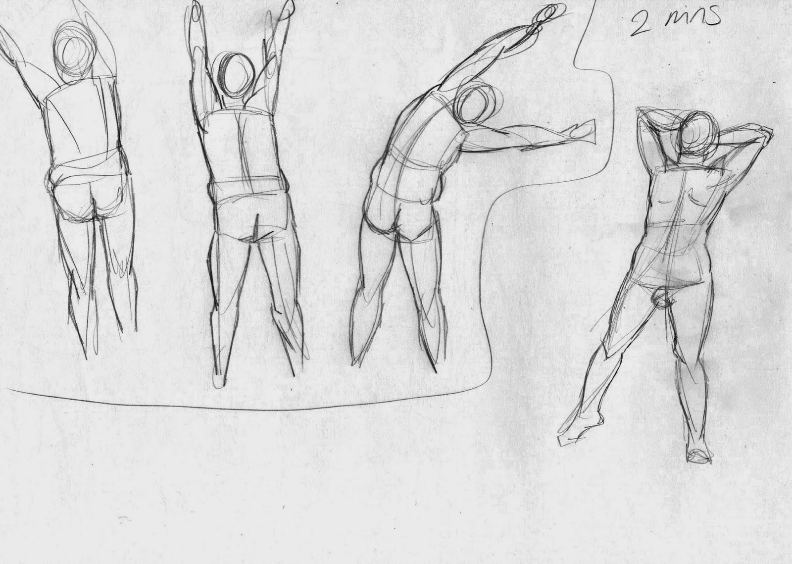
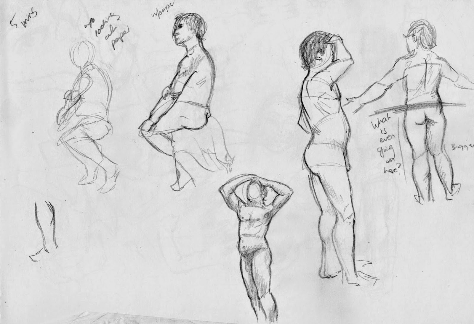
Excited for future, confidence gained and lots more experiments with gestures (more extreme! Has made work better) and get much more work done in smaller deadlines.


Reflection - Research

Art books I like the look/style of;


Shape experiments with colour to see the end outcome, no colour experiments. Works well for getting the body language down.


Pencil sketches of finished characters - shows shapes and how they work with other characters without getting distracted by colour. A chance to experiment with body language as well.


Looking at shapes faces and to decide on personality etc.


Expressions and poses, again to capture character.


Looking at the character at different ages, refining the shape.


Expressions and movements for personality, how exaggeratedly he walks/ how lively the character is and how he may interact with other characters.


Shapes, looking at current childrens' toys and seeing what makes it cuter/creepier.


Storyboard thumbs to plan out a scene with less defined sketches.


Accessories and final ideas, seeing what works without colour and concentrating on values.


Finding an outfits that works well for this character, looking at colours, patterns and shapes.


Exploring expressions to gain insight into how the character expresses themselves.


Plenty of annotation  to show layers/accessories/details to remember (especially useful for 3D modellers).


Cloudy With A Chance of Meatballs
Seeing what designs work and how it looks from different angles - do it look good? Is it too simple? Is it too complicated?

A two wall view of the room to see more of the detail and layout.


Can check if all shapes and details works well with each other, and have a catalogue of the buildings, vehicles and props that need to be made.


Mapping the depths and details of an environment and planning colours to get a feel for the scene.


See if all buildings are consistent and fit in with each other. Have them planned to drop into a setting after layout has already been thought of.


Wednesday, 30 April 2014

grizandnorm

"The Art of Griz and Norm" is a tumblr that I follow with very helpful tips for animators, especially when it comes to character animation. Griz works at DreamWorks as a Visual Development artist, and Norm is a storyboard artist at Disney.


Even without context, their art is so full of life that you know it works. It is good to see things shown in the simplest style as well, making it a lot easier to apply to other styles.


These are just tips that they post on their tumblr, but I think that collected as a book it could be extremely useful. Of course there are other books that talk about similar things, but some of them are so stylised that it is hard to apply them to other styles, and they can often rabbit on for pages before getting to the actual points needed. Context is obviously a good thing to have, but it is always possibly to have too much of it.

These are tips that I am going to try to incorporate into my work as much as I can.


Sunday, 27 April 2014

Transmedia Storytelling

Transmedia storytelling (alternatively called transmedia narrative or multiplatform storytelling) is telling one story through multiple formats/platforms - games, books, tv shows, comics, etc. It is not the same as 'cross-platform media franchises' adaptations or sequels that use different formats for different stories within one universe.


One example of this (tough it doesn't contain animation) is the Lizzie Bennet Diaries. They are  series of Youtube Vlogs telling a modern day version of Jane Austen's Pride and Prejudice. What makes it transmedia is that each of the characters have social media accounts (Twitters, Tumblrs) that are linked into the Vlogs; the other characters' sides of stories are told there, all tying in with the main show, allowing you to see more of the Lizzie Bennet universe from different points of view. I think that this is a particularly good idea because not only is there more content for viewers to see (and so more ways and opportunities for them to find the series) but it also means more frequent updates in one way or another, so excitement levels are kept high and viewers will be thinking of the series more often, as different social media platforms they check will involve different things to do with The Lizzie Bennet Diaries.


Defiance took a risk releasing a game and TV show at the same time that ties in together. A the show follows Nolan and Irisa in the town of Defiance, the game provides you with an RPG where you have your own character doing quests in missions in that town and surrounding areas, and in certain missions you will bump into and interact with both main characters from the show, as they follow the TV series' plot. The game even had some weekly events tying directly into that same week's episode meaning that you can interact directly with what you have just watched.
Although a good idea, the show/game hasn't done as well as hoped, but it must have been extremely expensive to produce the two at the time, so I think that with maybe better writing/directing and more experimenting with consoles' capabilities could have produced something better. I think that is a well written show with an already established fanbase did something similar to this, it would go down a lot better.


Assassins Creed has also experiment with transmedia storytelling. With the amount of characters and plots and time periods all tied together, there is a lot of stories that go untold, and at first it was only a case of reading between the lines and listening to the events in game. Later on, they began to release comics that ran alongside the games, shedding some light on other parts of the plot and other characters' sides of the stories. In some comics they vary slightly from the game (possibly because it would have given spoilers to later games) but on the whole they tell the same story. A 3 part film was also released on to Youtube, setting up the events of Assassins Creed 2. The film was live action acting mixed with backgrounds and locations from the game's environment. Transmedia is a great way to include all characters and tell all of their stories parallel to each other rather than just concentrating on the main protagonist, and it brings much more depth to the characters, which is vital for such a large franchise.


Motion Comics

Motion Comics combine animation and comic books to make a hybid of the two, using manning, voice acting and animation to enhance the art work already there. In some cases, text boxes, speech bubbles and thought bubbles (not that they are particularly used in comics anymore) are removed or moved, if hey are unnecessary because of the voice acting or get in the way of the art. Some motion comics create comics that work well with this medium, whereas some adapt already existing comcs.


Broken Saints was one of the earliest examples of this in 2001, and is pretty much what I expected when hearing the words 'motion comic'. There is panning, the character moves without being animated frame by frame, and text is still there while it is being narrated. This is an easy way to get the story, having both sound and visuals to concentrate on, although a downside is that you can't just read it at your own pace like with normal comics. On the other hand, you can see scenes in the comic as the writer/artist intended, with sounds effects and time to build up suspense.


Watchmen is adapted straight from some of the earlier comics, and while there are interesting effects, I feel like it is too animated. Almost like someone couldn't be bothered animating a full cartoon, so they left it half way. It doesn't feel like enough of a comic to me, using only the style and speech bubbles from the original medium, so it doesn't work quite as well.


Godkiller used original illustrations, making it easier to animate, but also taking a step further away from comics (in the opposite direction as Watchmen). If you could combine the two videos with this level of animation and the style of the Watchmen video, I think it would be a much more effective combination of comics and animation, and be much more interested.


Madefire Teaser Film from Madefire on Vimeo.

Though this is only a teaser film, the idea is very interesting, If the app works as well as the film suggests, it could give an extra dimension to the comics and move the images in a way that fits with the comic rather than just animating on top of a static comic background. It actually reminds me of some video games, specifically for DS. Things like The World Ends With You, Devil Survivor and Phoenix Wright all use a 2D approach for the narrative, moving the characters as the above does, although with a little bit less animation. I think that keeping the panels is especially effective, making it more comic book like, and this is how I would like to watch motion comics.

The Internet Animation Database


The Internet Animation Database provides an alternative to IMDB that involves only animated films/shows/shorts to make it easier to find accurate information for any of the above. It is still smaller than the site in was inspired by, but serves its function well.


You can search by character, year, studios, artists, title etc which makes it very convenient for finding what you are looking for, or even for discovering new animations.


The pages themselves are very plain, but provide the information needed, along with comments and reviews. It isn't the most indepth of websites, but it works if you just want to find new things or look up very specific animations. If it becomes larger and more popular in the future then it could be a very useful site, especially if it starts to over on from older 'classic' animations and into newer ones, especially ones that may not be published and are contributions from viewers (in a different way than Youtube and Newgrounds - although what would be the grounds on which an animation would be accepted? Length, method, style, audience?)

This is a site I will use for research in the future, even if it helps me to find animations more than actual facts about them.

Wednesday, 2 April 2014

Rebecca Sugar


Rebecca sugar (disseminate) from annapicariello

For my Disseminate project, I decided to talk about Rebecca Sugar, a director, writer and storyboard artist for Cartoon Network shows.

Her thesis animation, showed some very good design and interesting angles, but she is best known for her writing/storyboarding on Adventure Time, and for being the creator of Steven Universe.

Steven Universe is a cartoon based on Rebecca's younger brother (who also works alongside her on backgrounds). The show features characters of all colours, shapes and sizes as they fight to save the universe with Steven, a kid with powers who isn't exactly the sharpest crayon in the box. The show concentrates on acceptance and seeing the good in people, making it a happy lighthearted show even when things do well.

A surprising fact about this is that Rebecca Sugar is actually the first solo female creator to have a show on Cartoon Network which, in 2014, is crazy. There have been some co creators in the past, but none on their own. It can't be for lack of trying - there are plenty of female animators out there, and the number of female viewers on a lot of Cartoon Network shows is increasing, so maybe CN are stepping in and trying to make a change, or maybe Sugar's work blew them away so much that they couldn't say no. Either way she in an inspiration, and I look forwards to seeing more of her work, and the impact that her work will have on the Animation industry, at least where children's cartoons are involved.


Saturday, 22 March 2014

Kilogramme (Manchester Studio)


Kilogramme is an animation production company from Manchester, producing animations ranging from internet banners to adverts to childrens' TV shows. They cover both 2D and 3D animation, including concept and design, which is why I decided to visit their studio.

I live close to Manchester, and design, particularly in 2D is something that I am very interested in. Their studio space felt very wide and open, despite only being one part of a block of studios in the same building. It had a very friendly atmosphere, and all of the staff that I talked to were lovely. They used a range of programs, including Photoshop, After Effects and Flash. They work with different illustrators and their projects giving them a range of styles, and working with a lot of different style is something that I would love to do.

Jon Turner, who works at the helm of Kilogramme recommended me the book Cartoon Animation, by Preston Blair and suggested that I should look into doing more character turnarounds, which I will do in later project.

I asked about work experience but unfortunately they don't do that - however, we did discuss that if I email closer to the time that I would like to have done some, they can see if they have any studio space available and I could possibly bring some college work in to do, and I can get feedback and help from them if needed.

It was definitely worth going on a visit even if I did get quite nervous, but I am definitely going to go on more studio visits in the summer and try to keep in contact with as many people involving in Animation in Manchester as I can.


Thursday, 20 March 2014

Reflection - Initial Ideas

For our Reflect project, I want to do something that not only helps to show my experiences of the year, but the sort of things I am interested in pursuing in the course, and that I have enjoyed doing the most for it.

I love the idea of doing an art book kind of presentation (although will it have lots of small extra text?) giving me a chance to do some more character/environment design as well as experimenting with media, allowing me to show my year in a much more visual way.

Thoughts about this year to be presented;

- Intention to illustrate, not animate; accidentally happen into this course
- Actually more impatient with storyboards, less enjoy than I thought

Character design - loved it as expected and did most work in that, intend to do more in the future.

Backgrounds - was fun for the purpose of experimenting and looking at layout; sometimes uninspired but that could have been to do with the places I had available to draw; would like to try it with maybe famous/historical places.

Animation - need lots of work! Slowly trying new programs, less scared of After Effects now. Still enjoy it less than design though! Think I over complicate things too much with Photoshop, so other experimenting is needed.

Have some scenes/storyboards of the year nearer the end of the presentation? Or stick to design things?

Story ----> Char Design ---> Env Design ---> SBoard ---> short animated gifs


Presentation then character design heavy with some environment design, possibly some storyboards. Write a script to talk about? Can then help inform the presentation, order of things etc.

Thursday, 6 March 2014

Effective Presentation Tips

Presenting is about communicating something, and in a lot of cases, an opportunity to get constructive criticism and feedback from peers or an objective audience.

Be concise!
Know your audience - and assume they know nothing. Always put things into context, and inform your audience about what you are talking about.

Talk about;
- What you are doing
- How you got there
- How you plan to get there
- How you are planning to move forwards

A presentation should not be stressful... if you are prepared.

Be prepared!

Enjoy yourself!
Know your subject and keep it simple. Use imagery to illustrate a point... when necessary.

You should not use too much text. The audience is here to listen!

Each slide should be important and communicate clearly.
Avoid bullet points!

All slides should be readable from 8ft, or 2.45m (at least).

Be enthusiastic!
- You don't look as anxious as you feel.

Make a mistake?
Correct yourself and carry on!
Use cue cards, paper, post its, lecture notes etc

Don't leave it until the last minute!
Practice!
Give people time for questions!

Thursday, 13 February 2014

Thought Bubble - Sketching Spotlight

Sketching Spotlight

I visited the Sketching Spotlight Panel at Thought Bubble where 4 artists answered questions and talked about their creative processes while others had their drawings projected on the screen as they were drawing. The artists there were Ming Doyle, Fiona Staples and twins Fabio Moon and Gabriel Ba, all of whom work in comics/illustration.

I found it very interesting not only as a solo artist, but from a collaboration viewpoint. One of the ideas that came up a few times was that a collaboration, to many of them, was helping one another with ideas; it wasn't just a case on one person does one job and another person does theirs. They work better in a creative time where both know each others' styles, strengths and weaknesses in order to play off of them as best they can and keep improving each others' work.

Fiona Staples

Ming said that working in mainstream comics can feel a lot like drawing fanart at time, except that you are getting paid for it. Being able to draw other characters in your style is a very good skill to have which is shown greatly in the comics industry, but I think that does limit your opportunity to design big mainstream characters. Obviously you need at least a few as new and background characters in your comics - however the less mainstream comics, or non-superhero comics such as Saga drawn by Fiona Staples [left] are all original characters, with input from writers but creative freedom after that, which sounds like it would be a much more fun experience.
Ming Doyle

Fiona worked exclusively with digital media in her earlier career, with a Cintiq which didn't feel as different to traditional drawing as graphics tablets do. She now also uses a blue mechanical pencil to draw simpler shapes before inking. Ming Doyle also likes to use a lot of digital art in her sequential work just because of the time it saves her so that she can reach deadlines much easier. Both artists use MangaStudio for digital inking (recommended to them by Jamie McKelvie) with varying adjustment correction, and Ming works all at 25% for her drawings, which is a terrifying idea to me. She also does all of her midtones before the dark colors and then lays everything up. Fiona blows her thumbnails up, inks them in MangaStudio and then colors in Photoshop.

Some comments were made that some artists start of with comics etc to realise what they want to do art wise later and then realise that drawing comics is what they want to do, whereas some like Ming Doyle always wanted to draw to tell stories. They also talk about being invisible in their comics - that the art should flow so well that you don't even notice as you get carried away with the comic and the storytelling.

Gabriel Ba
Fabio Moon
Self-publishing is a good technique for starting out with a lot of first time stories being published through company 2000AD.  It was also said that a lot of the interesting comics come from people who don't actually make comics for a living - different experiences and ways of working works very well to create new and different stories.

Other advice was don't be afraid to learn on the job! "You're never really gonna be ready" was said which I think applies to a lot of different art form and fields. You need to build up a visual library which should not be limited to just things in comics/the style you want to work in.
 Gabriel Ba suggests to "hire a cute assistant to do your erasing" to avoid the pain of rubbing out so many lines.

Though most of the ideas came from two of the artists, it was really interesting to compare the way that some of them works, how they started in their pieces and their compositions. I definitely hope to go to this panel again next year, as some of the advice has been really helpful.


Thursday, 6 February 2014

Annie Awards Winners

As expected, Frozen was the film that performed the best at this year's Annie awards, taking away 5 awards including Best Animated Feature. The Croods was then second highest with 3 awards including best Character Animation and best Character Design which is still a large victories considering what other films they were up against. Monsters University unfortunately only got 2 - for Storyboarding and for Editorial (and no Oscar nomination!). The Croods, Frozen, Despicable Me 2, the Wind Rises and Ernest & Celestine all got a nomination but Monsters University missed out, which fans and critics alike are displeased with. Despicable Me 2 only won Best Animated TV/Broadcast Commercial which to me does not suggest Oscar material, but that could just be me being Bitter. I feel that Monsters University made a bigger impact on more of it's audiences but I don't actually know the grounds on which these films are judged or how they are nominated, so that is a discussion for another time.

Understanding Copyright

Copyright is "the right for the owner/creator/publisher to control how their material can be used".

Copyright covers films, games, animation, music, computer acts, drawings/illustrations - anything that is the result of an independent intellectual effort or a collaborative effort.

Author can object if their work is mutilated, defamed or distorted in any way. Sometimes though, copyright rights go to the company or employer involved with the property in question.

Copyright can be transfererd or sold to another party. In the UK, copyright is automatic. Literary, dramatic, artistic and photographic works are copyrights for life + 70 years of the creator.

Sounds recordings and copyrighted for 70 years only. (Cliff Richard got this changed from 50 to 70 in 2011).

Getting permission to use properties - you can contact the owner/organisation/company representing them directly. Otherwise, they can object and possibly sue.

If the thing you want to use the property for is commercial, you must ask permission. Non-commercial, education, research of private study does not generally need you to ask permission, although you may need an agreement for multiple copies.

Claiming Copyright
- Watermark etc
- Leave it/deposit it with a bank or lawyer
- Post it to yourself sealed with a date stamp.

If someone is breaching your copyright, talk to them first!

Any legal action would take place in the country where the infringement happened. Social Networking can have complex terms and conditions and may claim your work as their own.

Copyleft is like the opposite; they are a novel use of existing copyright to ensure work remains freely available.

Creative Commons - non-profit, providing legal framework to let people share, remix and reuse legally. Simple, standardised and an alternative to the "all rights reserved" paradigm of traditional licensing, as long as you credit everything.

There are also alternative that:
- do anything commercially but again apply credit
- Redistribution, commercial and otherwise usage is fine as long as it is unchanged with credit to you
- Remixing, tweaking and building on for non-commercial use as long as they are credited and also licensed under the same terms.

Thursday, 30 January 2014

Annie Awards


The Annie Awards are an American award for animation, meaning that animations don't have to to fight for the one animation-only award in the Oscars. This year, the awards will be given on February 1st, and the nominees make me very excited to see what the outcomes will be.

One of the things that I have noticed is that Frozen, Monsters University, Despicable Me 2 and The Croods have probably the most nominations out of anything there, so it will be interesting to see which of these end up with the most awards and what category they beat the others in.

The categories that all four films have been nominated in are Best Animated Feature, Character Animation in an Animated Feature Production, Character Design in an Animated Feature Production, Music in an Animated Feature Production, Production Design in an Animated Feature Production and Storyboarding in an Animated Feature Production. This includes some of things I am most interested in with animation - character design, production design and storyboarding.

For the Best Animated Feature, Frozen has a very good chance; though I have seen a lot of criticism from fans on the internet about sexism and the change from the source material, most of the reviews from critics that I have seen have been extremely positive, helped along by the fact that it won a Golden Globe for Best Animated Feature Film, winning out against The Croods and Despicable Me 2. However, I do think that Monsters University was a great film, so the fact that it wasn't even nominated for the Golden Globes might show that the awards are judged to different standards.

Frozen 
I think that Monsters Inc could fall a little bit in the Character design category, with many returning characters. though the changes they have made were very fitting and some of the new monsters were very creative, I think that they can't compare to the original film. I think that, again Frozen stands very strong here, with it's strong cast of characters with brilliant colour schemes, and Elsa's outfit when she creates her ice palace especially is one of my favourite Disney designs. The Croods' designs weren't the sort that I usually like, but I think that they are definitely different enough to be considered. However, Cloudy With A Chance Of Meatballs 2 is also nominated in this character, and the style and characters are definitely well done, and could have a chance themselves.


Frozen 
Croods 


I think it will be interesting either way to see the outcome of these awards, and to see if my predictions are anywhere near correct. I just hope that Monsters University gets enough awards that it deserves!