Showing posts with label Character Design. Show all posts

Sunday, 18 May 2014

Animated Self: Turnaround Tests

At first I scanned in the separate images I had drawn to create a very crude, basic turnaround, just to see how well the style would work. It could look good with more frames and if I corrected her stance - the character appears to be leaning at a very odd angle, and this would strange if I carried on with the turn around like that.


I made her stand up a little bit more straight and coloured over the base just to see how the outfit could look and test out some colours. I like the overall effect although the character still moves way too fast. This meant that I was on the right track though, so I then moved on to animation paper with some proper references of a human body from all angles.


I think that the turnaround looks much more 3D after drawing the character out properly. After using reference, the figure is a lot less stylised but I don't mind that as long as it works. I still have a lot to do before it is finished, so there would always be time to change things anyway.


I then went over the lines to get a much more cleaner turnaround and to double check the anatomy, before adding in the detail again ready to paint over.
I feel very optimistic at this point, and am definitely considering doing a couple of turnarounds rather than trying to add in animation of this character - I enjoyed the design process as always, and turnarounds will be very useful if I choose to continue doing it in the future, so I think that I will do as many turnarounds as time will allow, with maybe two or three turns each (as each turn is 2 seconds long).

Animated Self: Character Designs Part 2

I used Robert Valley's designs again as reference, to keep the character style consistent.


I got feedback that the body shape looked a little bit strange at times which I think is because the top proportions are very short, or at least wider than what usually works. I tested out a couple of other shapes changing the proportions around, and while I liked the one with thinner proportions, I thought that deciding on the actual character/clothing design would be more important, and the proportions could be changed to fit whatever style my character is.

Before I started developing any designs, I got invited to join a tabletop game of Rogue Trader - similar to Dungeons and Dragons, but with pirates in space. I thought that this could be a good idea to base my design off - I could create character, or give my choice of a few characters that would work well in this setting, meaning that instead of just being a flat design I could also think of the job ad purpose of the character. I set out looking for naval/pirate themed idea, helped by the research I had already done for my earlier sketches in Part 1, and started developing some designs for my space pirate pilot.

I tried to keep certain elements consistent throughout my designs, using the same sort of shapes/accessories (circles, lining of the clothes, buttons and/or buckles) to make them all fit into the same sort of setting in case I decided to use more than one design. This also keeps in with the theme of Rogue Trader and Warhammer 40K, a similar game, so that the design would be relevant to my character.


I definitely liked the pirate theme and wanted to keep it firmly in my designs. I also took inspiration from Disney's Treasure Planet which has quite a similar setting, and the show Firefly which is more of a Western but set in space, still combining sci-fi elements with other style of dress. At first I felt that the third image in the above page looked good but a little bit too dramatic; on doing some research into other player created characters, I realised that it actually wasn't that dramatic in comparison, so that was definitely one to think about using.

I thought that maybe looking more at layers could be a good idea as well, so I started experimenting above but they weren't quite as interesting as my previous designs, and didn't really capture the theme of the game too well. I decided that for now I would go with the design on the second page that really stood out to me, and on completing the turnaround, I could look back and decide if I wanted to take that further or have another look at my other designs.

Animated Self: Character Designs

For the Animated Self project, I decided that I definitely want to concentrate on character design, being one of my favorite parts of the animation process, so I started drawing with some vague ideas in mind.


First of all I looked at some armor throughout the ages - a lot of the games, TV shows and books I have been playing/watching/reading recently involve knights of some kind, so I thought it could be a good idea to do something that would keep my interest throughout the project. It was a lot of fun to draw armor, something that I haven't really done before, but since I was already considering turnarounds, I thought that 15 seconds worth of armor from various angles would be a little bit too adventurous for me at this point. Having got this idea out of my system, I then moved on.


Another thing that has popped up in a lot of games/shows recently is pirates, something that would be a lot of fun to design. The above characters are all referenced from the games and shows that I have been playing, but after drawing them I found that I still didn't really have many ideas for turnarounds or other animations, even if researching pirates had been a lot of fun.


I thought that at least getting a basic turnaround sheet would be useful, giving me some foundation to work upon. I used Robert Valley's style as this is one of my favorites, and one that I have enjoyed experimenting with since finding it in one of my earlier projects this year. There are not quite enough poses here for a complete turnaround (although at least two of them could be flipped for extra frames) but since this was already something solid for me to work from, I thought that it was time to look at more designs.


My ideas still weren't flowing as much as I wanted them to, so I typed 'Men's Fashion' in to Google to see what could come up. I did a few designs based on this as above, but they didn't feel as fun to do, and I wasn't particularly excited with them. I tried changing the proportions slightly to see if that could help but the one I started off with looked much better in the end. Still unsure of what to do, I decided to leave this part of the idea and move on to looking at designs for a female character, in Animated Self: Character Designs Part 2.

Wednesday, 14 May 2014

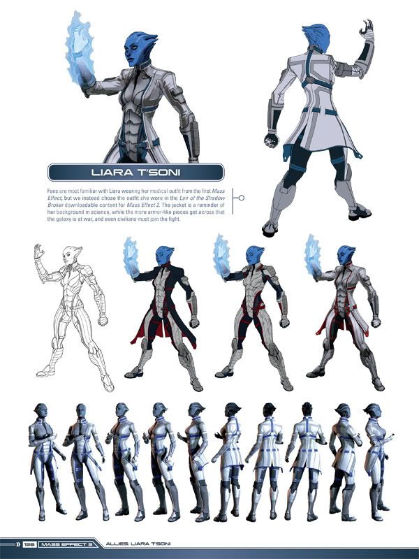
Character Design - Mass Effect

Mass Effect is one of my favorite games, with a heavy science fiction setting, huge plot and great focus on characters.

The game looks great, and is something that has influenced my ideas on some of my past projects. I got the art book because of how great the game looked, and it is by far one of the best art books I have found, especially from a student/artist point of view.


The book goes very in depth to the characters looks, showing art involving their personality and the more costume design side of things. I love seeing how artists get from one idea to another, and this really helps - you can see which parts of the design worked best, and how they were mixed in with others to create the finished product.


You also do not get many books showing characters from quite so many angles, and it looks great. Turnarounds are very important especially where 3D animation is involved, so the level of detail throughout the design has to be consistent, and also possible to model. The above shows how more detailed the front of the character is, while still keeping in with her theme and being interesting enough on the back.


Designing aliens would probably have been one of the hardest things to do for the game, in my opinion. There are so many places to start, and so many places to end - I am not surprised that they would have to go through so many ideas to find the right one. It is also good to see the 3D model - which parts were specifically built into the figure, and while parts would only be present as a texture on top. The evolution of the design really helps to show the sort of though process you would go through to get to a final design, and I would like to keep my ideas as open and explorative as this.


Tuesday, 13 May 2014

Robert Valley


Robert Valley is an animator, designer, director and storyboard artist from Canada. One of the things that he is most well known for is animation in many of Gorillaz animated music videos. Jamie Hewlett's character designs from the show had an impact on Valley's own style of character design, as seen in some of his most recent projects.

He has worked as a character designer on Motorcity, an animated series on Disney XD set in a futuristic version of the state of Detroit, focusing heavily on cars and action.

The show was animated in Flash, Maya and After Effect (with backgrounds made in photoshop), the former working extremely well with Valley's character style.


This style makes it easier to animate characters in flash, with things largely keep the shame kind of shapes and angles from different positions. Heads would be animated separately from the rest of the body, reusing already made assets rather than hand drawing each different position.

One of the things that attracted me to this style was how angular it was - a lot of childrens' animations use a lot more curves with softer characters having a safer, more friendly feel to them. Valley's approach is suitable for an action cartoon, using ore edgy and lively shapes. 

Another show he designed characters for was Tron: Uprising.

Tron had a much more science fiction vibe to it, and although similar in basic shapes, Valley has changed his style to something sleeker, taking out some of the sharper lines and angles.  This works very well, and the designs look just as appealing as those from Motorcity.

Robert Valley's style helped to influence some of m designs in an earlier project this year, and even though they were not designs that I chose to go through with, it is definitely a style I would love to explore further in future projects.