
One of the things I did this summer was practice stylising established characters, such as the above from the Fire Emblem series. I also wanted to draw them so that they could be made into stickers if I wanted to; their proportions are still a little large in comparison to other character stickers on sites like Redbubble, but it was good practice just to draw them different than I usually would. I also had to keep the colouring a lot more simple because each area of colour is only small and wouldn't necessarily print well with more detail.
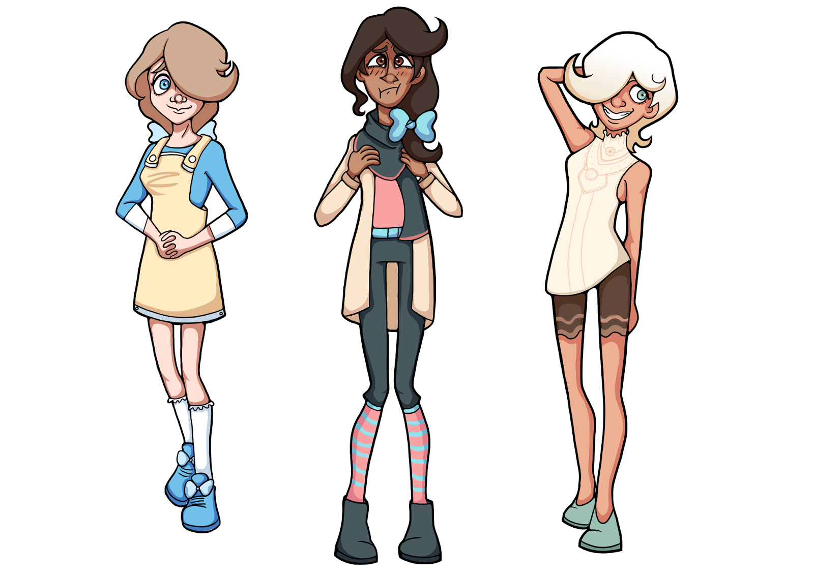

Inspired by Anna Cattish, I wanted to draw a few more skinny/stylised characters which did give me the proportions that shows like Teen Titans use. Each character has a flick, because I wanted to try out different shapes and styles of it to see how much that may affect how the character looks (and also I really just wanted to draw flicks). I also tested out some colouring styles and line widths; I wanted to keep it simple enough to work for animation, but I still think the lines would look better at a width inbetween both of these.

I decided that I should try to make my poses more interesting, since often they're just stiff and unoriginal. I started doing some more poses which I was proud of, but they still aren't that fluid.

I decided I should do some gesture drawing after that to help my poses a little bit more. I only spent 45 seconds on each because I knew that I would spend too long thinking over the anatomy, and it helped me capture the poses much better.

I did that with fight scenes afterwards because that is something that I'd really love to be able to draw. I did get distracted by anatomy a little more on that since many of the poses were from shows like Justice League, since the poses are more dynamic and interesting than a lot of photographs, and I could pause the video on any frame. Some of these are more fluid than others, but I think that I'm getting the hang of it.

Next I think I need to try more perspective with these - and actually put some designs onto them. I think that my designs will look much more effective with poses like this (as long as they are relevant to the character) than before.

I aim to do a lot more different, stylised designs this year, showing their personalities through much more fluid poses and a lot more colour experimenting. I would like to take more influence from the artists above who I have got a lot of inspiration from and see how far I can push my designs.