Saturday, 22 March 2014
Kilogramme (Manchester Studio)
Kilogramme is an animation production company from Manchester, producing animations ranging from internet banners to adverts to childrens' TV shows. They cover both 2D and 3D animation, including concept and design, which is why I decided to visit their studio.
I live close to Manchester, and design, particularly in 2D is something that I am very interested in. Their studio space felt very wide and open, despite only being one part of a block of studios in the same building. It had a very friendly atmosphere, and all of the staff that I talked to were lovely. They used a range of programs, including Photoshop, After Effects and Flash. They work with different illustrators and their projects giving them a range of styles, and working with a lot of different style is something that I would love to do.
Jon Turner, who works at the helm of Kilogramme recommended me the book Cartoon Animation, by Preston Blair and suggested that I should look into doing more character turnarounds, which I will do in later project.
I asked about work experience but unfortunately they don't do that - however, we did discuss that if I email closer to the time that I would like to have done some, they can see if they have any studio space available and I could possibly bring some college work in to do, and I can get feedback and help from them if needed.
It was definitely worth going on a visit even if I did get quite nervous, but I am definitely going to go on more studio visits in the summer and try to keep in contact with as many people involving in Animation in Manchester as I can.
Thursday, 20 March 2014
Reflection - Initial Ideas
For our Reflect project, I want to do something that not only helps to show my experiences of the year, but the sort of things I am interested in pursuing in the course, and that I have enjoyed doing the most for it.
I love the idea of doing an art book kind of presentation (although will it have lots of small extra text?) giving me a chance to do some more character/environment design as well as experimenting with media, allowing me to show my year in a much more visual way.
Thoughts about this year to be presented;
- Intention to illustrate, not animate; accidentally happen into this course
- Actually more impatient with storyboards, less enjoy than I thought
Character design - loved it as expected and did most work in that, intend to do more in the future.
Backgrounds - was fun for the purpose of experimenting and looking at layout; sometimes uninspired but that could have been to do with the places I had available to draw; would like to try it with maybe famous/historical places.
Animation - need lots of work! Slowly trying new programs, less scared of After Effects now. Still enjoy it less than design though! Think I over complicate things too much with Photoshop, so other experimenting is needed.
Have some scenes/storyboards of the year nearer the end of the presentation? Or stick to design things?
Story ----> Char Design ---> Env Design ---> SBoard ---> short animated gifs
Presentation then character design heavy with some environment design, possibly some storyboards. Write a script to talk about? Can then help inform the presentation, order of things etc.
Thursday, 6 March 2014
Effective Presentation Tips
Presenting is about communicating something, and in a lot of cases, an opportunity to get constructive criticism and feedback from peers or an objective audience.
Be concise!
Know your audience - and assume they know nothing. Always put things into context, and inform your audience about what you are talking about.
Talk about;
- What you are doing
- How you got there
- How you plan to get there
- How you are planning to move forwards
A presentation should not be stressful... if you are prepared.
Be prepared!
Enjoy yourself!
Know your subject and keep it simple. Use imagery to illustrate a point... when necessary.
You should not use too much text. The audience is here to listen!
Each slide should be important and communicate clearly.
Avoid bullet points!
All slides should be readable from 8ft, or 2.45m (at least).
Be enthusiastic!
- You don't look as anxious as you feel.
Make a mistake?
Correct yourself and carry on!
Use cue cards, paper, post its, lecture notes etc
Don't leave it until the last minute!
Practice!
Give people time for questions!
Thursday, 13 February 2014
Thought Bubble - Sketching Spotlight
Sketching Spotlight
I visited the Sketching Spotlight Panel at Thought Bubble where 4 artists answered questions and talked about their creative processes while others had their drawings projected on the screen as they were drawing. The artists there were Ming Doyle, Fiona Staples and twins Fabio Moon and Gabriel Ba, all of whom work in comics/illustration.I found it very interesting not only as a solo artist, but from a collaboration viewpoint. One of the ideas that came up a few times was that a collaboration, to many of them, was helping one another with ideas; it wasn't just a case on one person does one job and another person does theirs. They work better in a creative time where both know each others' styles, strengths and weaknesses in order to play off of them as best they can and keep improving each others' work.
 |
| Fiona Staples |
Ming said that working in mainstream comics can feel a lot like drawing fanart at time, except that you are getting paid for it. Being able to draw other characters in your style is a very good skill to have which is shown greatly in the comics industry, but I think that does limit your opportunity to design big mainstream characters. Obviously you need at least a few as new and background characters in your comics - however the less mainstream comics, or non-superhero comics such as Saga drawn by Fiona Staples [left] are all original characters, with input from writers but creative freedom after that, which sounds like it would be a much more fun experience.
 |
| Ming Doyle |
Fiona worked exclusively with digital media in her earlier career, with a Cintiq which didn't feel as different to traditional drawing as graphics tablets do. She now also uses a blue mechanical pencil to draw simpler shapes before inking. Ming Doyle also likes to use a lot of digital art in her sequential work just because of the time it saves her so that she can reach deadlines much easier. Both artists use MangaStudio for digital inking (recommended to them by Jamie McKelvie) with varying adjustment correction, and Ming works all at 25% for her drawings, which is a terrifying idea to me. She also does all of her midtones before the dark colors and then lays everything up. Fiona blows her thumbnails up, inks them in MangaStudio and then colors in Photoshop.
Some comments were made that some artists start of with comics etc to realise what they want to do art wise later and then realise that drawing comics is what they want to do, whereas some like Ming Doyle always wanted to draw to tell stories. They also talk about being invisible in their comics - that the art should flow so well that you don't even notice as you get carried away with the comic and the storytelling.
 |
| Gabriel Ba |
 |
| Fabio Moon |
Other advice was don't be afraid to learn on the job! "You're never really gonna be ready" was said which I think applies to a lot of different art form and fields. You need to build up a visual library which should not be limited to just things in comics/the style you want to work in.
Gabriel Ba suggests to "hire a cute assistant to do your erasing" to avoid the pain of rubbing out so many lines.
Though most of the ideas came from two of the artists, it was really interesting to compare the way that some of them works, how they started in their pieces and their compositions. I definitely hope to go to this panel again next year, as some of the advice has been really helpful.
Thursday, 6 February 2014
Annie Awards Winners
As expected, Frozen was the film that performed the best at this year's Annie awards, taking away 5 awards including Best Animated Feature. The Croods was then second highest with 3 awards including best Character Animation and best Character Design which is still a large victories considering what other films they were up against. Monsters University unfortunately only got 2 - for Storyboarding and for Editorial (and no Oscar nomination!). The Croods, Frozen, Despicable Me 2, the Wind Rises and Ernest & Celestine all got a nomination but Monsters University missed out, which fans and critics alike are displeased with. Despicable Me 2 only won Best Animated TV/Broadcast Commercial which to me does not suggest Oscar material, but that could just be me being Bitter. I feel that Monsters University made a bigger impact on more of it's audiences but I don't actually know the grounds on which these films are judged or how they are nominated, so that is a discussion for another time.
Understanding Copyright
Copyright is "the right for the owner/creator/publisher to control how their material can be used".
Copyright covers films, games, animation, music, computer acts, drawings/illustrations - anything that is the result of an independent intellectual effort or a collaborative effort.
Author can object if their work is mutilated, defamed or distorted in any way. Sometimes though, copyright rights go to the company or employer involved with the property in question.
Copyright can be transfererd or sold to another party. In the UK, copyright is automatic. Literary, dramatic, artistic and photographic works are copyrights for life + 70 years of the creator.
Sounds recordings and copyrighted for 70 years only. (Cliff Richard got this changed from 50 to 70 in 2011).
Getting permission to use properties - you can contact the owner/organisation/company representing them directly. Otherwise, they can object and possibly sue.
If the thing you want to use the property for is commercial, you must ask permission. Non-commercial, education, research of private study does not generally need you to ask permission, although you may need an agreement for multiple copies.
Claiming Copyright
- Watermark etc
- Leave it/deposit it with a bank or lawyer
- Post it to yourself sealed with a date stamp.
If someone is breaching your copyright, talk to them first!
Any legal action would take place in the country where the infringement happened. Social Networking can have complex terms and conditions and may claim your work as their own.
Copyleft is like the opposite; they are a novel use of existing copyright to ensure work remains freely available.
Creative Commons - non-profit, providing legal framework to let people share, remix and reuse legally. Simple, standardised and an alternative to the "all rights reserved" paradigm of traditional licensing, as long as you credit everything.
There are also alternative that:
- do anything commercially but again apply credit
- Redistribution, commercial and otherwise usage is fine as long as it is unchanged with credit to you
- Remixing, tweaking and building on for non-commercial use as long as they are credited and also licensed under the same terms.
Thursday, 30 January 2014
Annie Awards
The Annie Awards are an American award for animation, meaning that animations don't have to to fight for the one animation-only award in the Oscars. This year, the awards will be given on February 1st, and the nominees make me very excited to see what the outcomes will be.
One of the things that I have noticed is that Frozen, Monsters University, Despicable Me 2 and The Croods have probably the most nominations out of anything there, so it will be interesting to see which of these end up with the most awards and what category they beat the others in.
The categories that all four films have been nominated in are Best Animated Feature, Character Animation in an Animated Feature Production, Character Design in an Animated Feature Production, Music in an Animated Feature Production, Production Design in an Animated Feature Production and Storyboarding in an Animated Feature Production. This includes some of things I am most interested in with animation - character design, production design and storyboarding.
For the Best Animated Feature, Frozen has a very good chance; though I have seen a lot of criticism from fans on the internet about sexism and the change from the source material, most of the reviews from critics that I have seen have been extremely positive, helped along by the fact that it won a Golden Globe for Best Animated Feature Film, winning out against The Croods and Despicable Me 2. However, I do think that Monsters University was a great film, so the fact that it wasn't even nominated for the Golden Globes might show that the awards are judged to different standards.
 |
| Frozen |
 |
| Frozen |
 |
| Croods |
I think it will be interesting either way to see the outcome of these awards, and to see if my predictions are anywhere near correct. I just hope that Monsters University gets enough awards that it deserves!
Friday, 20 December 2013
Thought Bubble Sequential Art Festival + YA Panel
The first convention I ever went to was Thought Bubble Sequential Art Festival in 2012 and it was more fun than I could have imagined; that meant that I definitely had to go this year, and with of the panels I managed to visit this time as well, it was even better.
One of my favorite things about the whole convention was the friendly atmosphere, and the chance to talk to illustrators with various levels of experience. I spoke to a couple who launched their comic online and had a few copies at hand, comic artists working for Marvel/DC/Image and illustrators just planning selling their own prints. It was great to learn a bit about how people started making money from their art after uni or even just sixth form, and I'm definitely tempted to get a table in a few years and try selling some of my own stuff.
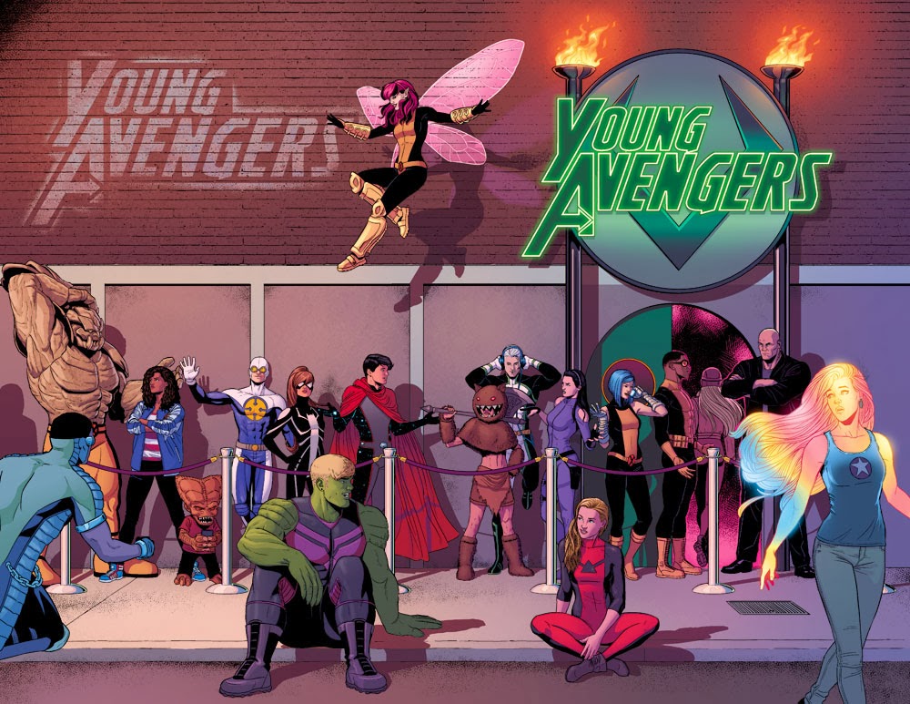
A highlight of the convention for me was the Young Avengers panel. The series was announced to be ending a few weeks before meaning that this would be my last chance to hear the writer and artist of my favorite comic talk about that comic, so it was something I definitely could not miss.
Being the end of the series by choice, and not by cancellation, they decided to do something a little bit different. The last two issues used a New Year's Eve party to wrap things up, and they got the help of a lot of different artists to draw short stories from the event.
Jamie McKelvie is the usual artist on Young Avengers, meaning that he still got the most control over the two issues even though he was only doing art for a small part of it. He told us that he uses Google Sketch Up to plan out backgrounds for a lot of his scenes, to keep track of the locations and for certain angles. He sent the plan for background to all of the artists involved so that they were kept consistent and understandable. Jamie also gave the other artists some control over his characters' appearances; they all had specific character stories that they were each drawing, but if someone drew a background character first, they would send the pages to to the other artists and that was the outfit that they would have to use, again keeping it all consistent
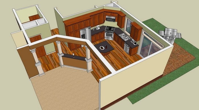 |
| Example of Sketchup - Not McKelvie's work |
Gillen and McKelvie, the artist and writer keep a blog with inspiration for outfits and music to go with their comics as inspiration and reference, something they can work on at all times and not just from their desks.
Below are some pages drawn by other artists over the two issues;
 |
| Annie Wu |
 |
| Emma Viceli |
 |
| Becky Cloonan |
 |
| Christian Ward |
 |
| Joe Quinones |
 |
| Ming Doyle |
 |
| Double cover by Jamie McKelvie |
Saturday, 30 November 2013
BAF 2013 - Bradford Animation Festival
BAF 2013 was a very fun experience for me, and the first animation festival I've been to. It was good to see all sorts of different types of techniques and ideas, a lot of which I haven't really looked into before. It helped to change my opinion on some kinds of animation, and helped to give me ideas for my own future animations.
One thing I noticed at the festival was that I much preferred the student films over the professional ones. I don't know if it's just that the professional ones broached weirder subjects, or normal subjects in weird ways that I'm not too keen on, whereas the student ones seemed more entertaining with the more upbeat and colourful kind of styles that I prefer.
On the first day we went, I didn't enjoy as many of that films as I liked, with most of them being as weird as above, but I did enjoy the talks - it was interesting to see the links to animation that illustrator Dave McKean had which was fun because a lot of his work includes covers for comics, something that I'm very interested in as both a viewer and student. Though his style wasn't the usual thing I look it, it was good to see where a lot of his ideas came from.
Lee Hardcastle's talk was one I wasn't looking too forwards to seeing, just because I find both clay and puppets boring, and with his work concentrating on claymation, I didn't think I would enjoy it or that it would be relevant to me at all. I was pleasantly surprised when watching his animations that I enjoyed them so much - mostly from the comedy aspect of it, but it showed how even an animation that has less regard for style can have an audience, and that it could be something to try out in my own time, if I felt like it. I still wouldn't consider clay as something I would want to work with professionally, but I feel less against trying than I did before.
The second day was more fun with the talk from Double Negative, who did a lot of special effects on films that I love. I considered looking at special effects courses a while ago, but I know nothing about, well, anything to do with it, and I wouldn't even know where to start. It was good to get an insight into the industry and the process, and now I notice the small things more often that would have been put into films this way. The films they talked about to us was Rush, about a huge crash in Formula 1 racing. I was surprised to see how much went into this - into their other films like Thor or Harry Potter, I would expect a lot of different things to be put into it, but for something that looks so ordinary, it is crazy.
The rest of the animations for the day were great as well - there were a lot more 2D upbeat ones which is much more to my taste. Rabbit and Deer was a great show of mixed media and I really enjoyed watching that - it is something I would definitely rewatch, or keep an eye out for more of. Three Grandmas was also enjoyable, and something I wouldn't mind looking up again. The Random Acts section of the day was alright - it was interesting to see what people can fit into 3 minutes of animation but again the styles weren't my sort of thing, and that did make me a lot less interested in it.
The third and last day we went was fun as well - possibly more fun than the second; there were more separate things I enjoyed, but the Double Negative talk was the most interesting and well structured segment there and I'm not sure if anything could have beat that. Michaela Pavlatova's work was interesting and entertaining to watch, especially with the expressions but a lot of her earlier work that ignored backgrounds wasn't as interesting to me. I did like her commentary on how she had more motivation for work when she was unhappier, and being happy gave her less inspiration - you can see how that is relevant in a lot of peoples' work.
MacKinnon and Saunders had a very fun talk - again, I wasn't sure at first because something about puppets just tends to annoy me, except for much of Tim Burton's films. With all of the puppets that the company made for his films and how closely they work with him, that made me a lot more interested in it. It was cool to see how many different parts go into it and how many different jobs there are in the company. I never realised that they were located so close to me as well, in Altringham - I would definitely consider work experience there if I had any interest in using puppets for animation, but it still isn't anything I would be interested enough in to try.
After that we watched Frankenweenie which uses their puppets, and it was a great film that I really enjoyed
I enjoyed the festival a lot, and will be so excited to go again next year. I've learned a lot about animation and to be more open about types of and ideas around it. I definitely have a lot more artists and animators to be following now!
 |
| Dave McKean - Sandman |
One thing I noticed at the festival was that I much preferred the student films over the professional ones. I don't know if it's just that the professional ones broached weirder subjects, or normal subjects in weird ways that I'm not too keen on, whereas the student ones seemed more entertaining with the more upbeat and colourful kind of styles that I prefer.
On the first day we went, I didn't enjoy as many of that films as I liked, with most of them being as weird as above, but I did enjoy the talks - it was interesting to see the links to animation that illustrator Dave McKean had which was fun because a lot of his work includes covers for comics, something that I'm very interested in as both a viewer and student. Though his style wasn't the usual thing I look it, it was good to see where a lot of his ideas came from.
Lee Hardcastle's talk was one I wasn't looking too forwards to seeing, just because I find both clay and puppets boring, and with his work concentrating on claymation, I didn't think I would enjoy it or that it would be relevant to me at all. I was pleasantly surprised when watching his animations that I enjoyed them so much - mostly from the comedy aspect of it, but it showed how even an animation that has less regard for style can have an audience, and that it could be something to try out in my own time, if I felt like it. I still wouldn't consider clay as something I would want to work with professionally, but I feel less against trying than I did before.
The second day was more fun with the talk from Double Negative, who did a lot of special effects on films that I love. I considered looking at special effects courses a while ago, but I know nothing about, well, anything to do with it, and I wouldn't even know where to start. It was good to get an insight into the industry and the process, and now I notice the small things more often that would have been put into films this way. The films they talked about to us was Rush, about a huge crash in Formula 1 racing. I was surprised to see how much went into this - into their other films like Thor or Harry Potter, I would expect a lot of different things to be put into it, but for something that looks so ordinary, it is crazy.
 |
| Rabbit and Deer |
 |
| Tram - Michaela Pavlatova |
 |
| Frankenweenie |
After that we watched Frankenweenie which uses their puppets, and it was a great film that I really enjoyed
I enjoyed the festival a lot, and will be so excited to go again next year. I've learned a lot about animation and to be more open about types of and ideas around it. I definitely have a lot more artists and animators to be following now!
Saturday, 9 November 2013
Loki - New Comic Book Character Design
 |
| MCU Loki |
Most people will know Loki by his MCU (Marvel Cinematic Universe) version, but the Loki I like the most is - was - Kid Loki. After Loki died in the comics, his brother Thor brought him back to life... as a child. Loki strived to change everyone's opinion of him while he had a chance, but no one would ever believe he wasn't a monster. Eventually he managed to save the world, but at a price... his new found life as a hero.
 |
| Kid Loki |
The old Loki took over his childlike body, and through schemes and plans, he assembled the Young Avengers, and used the superhero Wiccan's powers to restore him to an older, more powerful body.
 |
| New Loki |
The designs for new Loki has taken obvious influence from the MCU Loki, probably using the familiarity MCU fans have of him to bring in new readers to the Young Avengers comic and to Loki's new comic in the future (which, of course, I'll be excited about. Unfortunately, Kieron Gillen wouldn't be writing Loki anymore, but I can still give it a try).
 |
| New Loki as seen in Young Avengers #11 |
 |
| That's what you get, Loki |
Thursday, 7 November 2013
MOSI Exhibition - Cosgrove Hall
Manchester Museum of Science and Industry recently held an animation exhibition, focussing on Cosgrove Hall films. The exhibition was smaller than I'd have liked it to be (only a room!) but it was full of storyboards and scripts and different models and parts of models form their films and TV shows.
The creators of the company, Brian Cosgrove and Mark Hall met at university in Manchester, later becoming co-workers at Manchester College of Art and Design (which is now Manchester Metropolitan University). Hall created his own company - Stop Frame Productions in 1969, with Cosgrove joining shortly after. The company ran for 6 years until 1975, after which the producer of one of the serieses' they made called Rainbow created his own animation studio called Cosgrove Hall Films, comissioning the two as lead animators. The company changed ownership a fir bit until it finally ended up in the hands of ITV.
Some of the companies' most famous work consists of Dangermouse, The Wind in the Willows, Bill and Ben and James and the Giant peach, all things I watched when I was younger. Childrens' shows became one of the studio's specialities, but they also made the BBC's first fully animated webcasts, Ghosts of Albion, and also an animated Doctor Who story made just for the BBC website.
As ITV began cutting down on franchises, they had a financial review deciding that there was not enough interest in Cosgrove Hall to invest further, and so the company was shut down. In 2011, Cosgrove Hall Fitzpatrick Entertainment was formed with the help of an intellectual property lawyer, Francis Fitzpatrick. Mark Hall died later that year, and his son took his place working alongside Brian Cosgrove.
Notable other people having worked at Cosgrove Hall include Ian MacKinnon and Peter Saunders (MacKinnon&Saunders) and John Squire (Stone Roses)
The creators of the company, Brian Cosgrove and Mark Hall met at university in Manchester, later becoming co-workers at Manchester College of Art and Design (which is now Manchester Metropolitan University). Hall created his own company - Stop Frame Productions in 1969, with Cosgrove joining shortly after. The company ran for 6 years until 1975, after which the producer of one of the serieses' they made called Rainbow created his own animation studio called Cosgrove Hall Films, comissioning the two as lead animators. The company changed ownership a fir bit until it finally ended up in the hands of ITV.
Some of the companies' most famous work consists of Dangermouse, The Wind in the Willows, Bill and Ben and James and the Giant peach, all things I watched when I was younger. Childrens' shows became one of the studio's specialities, but they also made the BBC's first fully animated webcasts, Ghosts of Albion, and also an animated Doctor Who story made just for the BBC website.
 |
| James and the Giant Peach |
 |
| Bill and Ben models |
As ITV began cutting down on franchises, they had a financial review deciding that there was not enough interest in Cosgrove Hall to invest further, and so the company was shut down. In 2011, Cosgrove Hall Fitzpatrick Entertainment was formed with the help of an intellectual property lawyer, Francis Fitzpatrick. Mark Hall died later that year, and his son took his place working alongside Brian Cosgrove.
Notable other people having worked at Cosgrove Hall include Ian MacKinnon and Peter Saunders (MacKinnon&Saunders) and John Squire (Stone Roses)
Pokemon: Evolution of Graphics
Pokemon X and Y launched on the 12th of October, and after a few weeks of waiting, I finally have my hands on my own copy. I've played Pokemon games for over half of my life, and one of my favorite things about a new game is seeing the change in graphics and style.
The new game is made for the 3DS, which means there's an even bigger jump in style this time. In this post, I'm going to explore the change from 1995, the first games, to 2013, with the newest ones.
Pokemon Red, Blue and Yellow were the first games in the franchise, for the Gameboy Colour. The colours in the actual game were limited (ironically), showing more colour in Pokemon battles than in the actual world where your character walked around. Everything was extremely square, with a low resolution screen and limited space. Backgrounds weren't even apart of Pokemon battles, instead keeping them simple to concentrate on the gameplay rather than the visuals.
Pokemon Gold, Silver and Crystal in 1999 didn't have a huge change in graphics compared to the newer ones, but both Pokemon and the main world had a lot more color. It was a lot more interesting visually, and environment designs looked a lot more interesting, even if they were still stuck with too many square shapes.
Ruby, Sapphire and Emerald (2004) had a huge jump in graphics. It was the first Pokemon game for the new Gameboy Advanced - and the GBA SP which featured a backlight, something that was much needed for the older games. Everything has bright color that fits nicely with the environment, and even the battles have patterns and colors for their background, depending on what location you are in. Though still very square and blocky for the most part, there are a lot more interesting shapes that make certain parts of the environment (i.e trees) seem a lot less stuck together.
The next games out were Pearl, Diamond and Platinum (2009), and Soul Silver and Heart Gold, in 210, both of which had very similar designs. Above is Heart Gold/Soul Silver gameplay, picked just from personal preference. Environments have again improved, a lot more realistic and shaped than before. There's a wider range of colors, and shading isn't as plain now - the game uses a pseudo-3D style of rendering to make things like the trees much more realistic.The next couple of games, Pokemon Black and White used largely the same style.
Pokemon X and Y are the newest games of the series, released in 2013 for the 3DS, which changed the graphics drastically. Rather than the typical frame-by-frame animation of the earlier 2D games, small 3D models are used instead of sprites, including those of Pokemon in the actual battles - with the 3D switch on, you can watch the battle in 3D without any glasses if you can manage to hold the console extremely still, and not get a headache or any queasiness from it. Though I don't particularly like the actual 3D mode you can put it on, the 3D animation inside the actual game looks good. It's so far from Pokemon Yellow that it barely feels like the same franchise, but the games style every new generation has led into this style smoothly enough, and I think it is a good change, especially with a wider target audience - there's no worry of keeping the game in the Pokemon 'style' anymore - the older games are already considered as retro, and this new style is accepted a lot more among newer viewers.
Thursday, 10 October 2013
Reflective Practice
Why you chose to study on this programme?
Over the last few years, there have been a few things I've wanted to do as a career; these changed between game designer, animator, comic book artist and illustrator. It depended on my interests and course at the time. In early high school when I first started reading comics, I wished I could make art as gorgeous as the art I saw in Infinite Crisis. The I wanted to be an animator, after getting into anime for a year or two, and then back into western cartoons. I got an Xbox in early sixth form, and I had always loved to look at concept art already, but the games I found on that console made me really wish I could make them. Towards the end of sixth form and into my foundation I realised how much more versatile my work could be if I was to do illustration - that could cover so much of the stuff I wanted to do in one neat course. I applied for all illustration courses in the end, with the aim to go to Leeds since the course sounded like it involved a lot of what I wanted, and had the opportunity to collaborate closely with the Animation course. On my interview I was told I was better suited for Animation, and after some consideration I thought that sounds about right - I want to be able to make characters that last for more than one or two images, with the chance to bring them to life and put them in a world of their own, and I think that Animation would probably be the best medium to do that it.
What do you want to learn during your time on the programme?
First and foremost - to animate. But beyond that, I want to be able to make great character designs, and also get better with anatomy and consistency. I think learning to manage my time and to motivate myself would be great to learn as well.
What skills do you think are your strengths?
I'm very versatile when it comes to my work; I'm always happy to try new things and experiment, and I can switch between styles to suit the task at hand. I'm also very organised, and I'm good at prioritising things I need to do.
What things that you want to improve?
Mostly what I said two questions up - anatomy, consistency, time management and designs for characters.
What ways you will evaluate your progress?
I will mostly use peer/teacher input and put my work online to get input from other people as well. I will also use grading and formal assessments to see how well I am doing.
Subscribe to:
Posts (Atom)