Tuesday, 5 May 2015

Star vs the Forces of Evil: Backgrounds

Character design is obviously my main focus, although the idea of character animation is interesting too, but one thing I want to try to explore more in the future is backgrounds and other parts of visual development - one thing that I feel SvtFoE does really well. Justin Parpan is one of the art directors on the show, but also creates a lot of the backgrounds himself.


One thing that I really love about the backgrounds is the simplicity. A lot of animated shows use beautifully painted backgrounds which look great, and there are a lot of hybrids, or shows like Steven Universe and Craig McCracked shows like The Powerpuff Girls that use flat backgrounds with brushes that give them a more painted effect, and I really enjoy those in animation. However, the SvtFoE backgrounds fit in with the characters much more, in my opinion - they are in a similar, flat colour style which makes for much easier interaction with and integration of props within the background - as opposed to flat colour props awkwardly placed in a painted scene. I haven't seen too many shows do this, recently at least, and especially as Star interacts with so much of any environment she is in, I think it works really well. I feel like this would be a great place for me to starts with looking at the background part of visual development; the simplicity means that I can focus on design without having to worry about the rendering as much, and  it should work well with the sort of characters that I like designing.

I also love the colours - there is always a lot of variation within colours, but the proportions of colours are done very well. There is a lot more orange/red kind of tones in the top image, with smaller bits of blue/green to complement it rather than overpower it. The opposite can be said with the second image, with most of the house being green and the smaller details being orange tones. The second image is slightly less saturated as well compared to the first image, as indoor lights are generally a lot less bright than sunlight outside. The background designs for this show demonstrate a great understanding of colour theory and lighting, which is one of the reasons that it is so effective. I should definitely take that into account and try to study this further this summer.

Star Vs the Forces of Evil - Characters


Star Vs the Forces of Evil is a new show from Disney XD that I absolutely love the art direction of (and no complaints about the story or characters here, either).


The character design somewhat reminds me of the kind of Cartoon Network styles that I have been looking up this year for my Applied project; simple shapes that are easy to animate, but also build up to make silhouettes that look very different from each other. The colours are bright, adding to the fun, upbeat atmosphere of the programme - even if the characters are fighting Evil quite a lot of the time, it doesn't stop the overall feel of the show being light and bouncy. The lines make sure that the characters stand out well from the background, and complements the simple shapes. The designs feel very well put together, and for Star and Marco (the main two characters above), you can easily tell a lot about them from their appearance. 

Marco is more your typical teenager, complete with hoodie and converse looking shoes; he isn't particularly a jock or a nerd, he doesn't fit in with any particular social groups, making him a little more relatable to the young audience of children from around 6-11. Star has a few more things going on in her outfit - the dress and striped socks showing the bubbly, more typically feminine side of her - which is expected from a Disney princes. On the other hand, she has a headband with devil horns, and animal looking boots completely with spiky teeth and horns. This shows the more mischievous, dangerous side of her - which fits well, because at least half of the dangerous situations that happen in the show come about because of her carelessness or misuse of magic. She always has good intentions though, keeping her from feeling like a bad influence or promoting the dangerous things that she does. Overall, the designs don't skew towards one demographic - the characters in the show appeal to a wide audience.

The animation is very fun and bouncy as well, which works nicely with the design. The principles of animation such as secondary action, follow through and overlapping movement is applied extremely well in this, making the characters feel much more lifelike and full of personality. there is always multiple things going on at once, and the animation consistently fills the scenes up with interesting things - I feel like you could easily watch this show without the audio and understand what is happening, the characters' reactions to what is happening and the people around them. Usually the character animation in 20 minute shows, at least the ones that I have watched, don't seem to put this much effort in every little movements - they might have great fight sequences and special effects, but SvtFoE really stands out to me when it comes to animating body language and the smaller movements.

Monday, 4 May 2015

Sakiko

One artist that I am really enjoying at the moment is Sakiko (http://gekiamana.tumblr.com/). As soon as I saw their art of Star Vs the Forces of Evil, I had to go and check out the rest of it and I wasn't disappointed. The poses show the characters' personalities really well. and they are clear, readable and flow really well. The thing that I like the most though, is the colouring. They switch between black lines and coloured, both of which look great, and their colours tend to be bright and vivid. The shadows are still bright and saturated and the characters just look so alive. I want to try and use more bright colours and lines to make my art as exciting as these illustrations.


Portfolio Research

For researching specific portfolios, I wanted to find ones that actually seemed to have personalities, and actually thinks about bringing the characters alive rather than just throws on whatever designs they may have. I feel like it is probably easy to just find whatever designs you have done that you think looks good and put them all together, but that would not be enough to catch a potential employer's eye.


https://johnjagusak.carbonmade.com/projects/4066465
Though this portfolio is too long in my opinion, and looks more like a character design dump, I think some of the designs really stand out. Jagusak uses expressions and body language to show the actual personality of his characters really well as the shape and design of the character. I could easily imagine how many of these would act in an actual animated series, even down to the sort of voice they would have. The visual style a lot of the characters have remind me a lot of Cartoon Network characters, which might be good for some studios but it means that Jagusak doesn't necessarily have a style that stands out, and I don't think I would recognise his work if I saw it again (minus the name).

http://www.celine-kim.com/
Celine Kim again uses very nice expressions and poses to get the characters' personalities across - their use of the line of action is very clear and effective too, making the poses that much more exciting. They show thought into the material of the props and specific measurements which would help so much for 3D animators especially. The storytelling is very strong even within only one image, and it is clear that they aren't just designing for the sake of designing. There is a lot of passion put into this - not only is the character design great but even the backgrounds, props and colour keys have a lot of effort put into them. Kim shows that they are effective at visual development with everything being clear and giving you a very specific, confident idea of what this story will look like, and I think that it is an effective portfolio.

https://www.behance.net/gallery/12109707/Portfolio-2013
One of the things I like most about Chiara Benedetti's 2013 portfolio is the layout - everything is clear and concise, with the headings explaining the project without being too distracting or boring. The layout stays consistent even when moving projects/area and definitely feels like a solid portfolio. It changes a little when it comes to the digital paintings but I think that is necessary to make sure that they stand out.

https://www.behance.net/gallery/17767069/Chiara-Benedetti-Portfolio-2014
Benedetti's layout changes for her 2014 portfolio but so does the theme and tone of the work - there is a lot more focus on props and backgrounds in this compared to character design, also showing more interest in colour and layout. The work quality already makes this portfolio look much more professional, and like there is a clearer focus on what jobs exactly Benedetti is pursuing. The layout could almost be boring if not for how well the images use space - there is not a lot left blank, yet things don't look too clustered. It would be nice to see some of the backgrounds on their own page and a little bigger but with everything going on in the images, I think that it works well.

Saturday, 2 May 2015

Chris Sasaki Talk Part 2

Still uses stuff from learning animation and storyboards, needed to use a lot more of that than expected. Need to have a foundation of everything and focus at the end. Hurt portfolio by putting things in that were less confident about. Also talks to costume designers a lot - textures and movement are v important in 3d art. Gives suggestions for colour but that designs are often then passed over to the colour department. Hs like 12/15 artists on each film including char des, environment, lighting/shading. Works together, see what they are all working on, keeping world consistent but they only do work for their own department. Design is secondary to story. Second assignment ever was a silhouette assignment; automatically learned at college etc. Chaplin and Mr Bean, great considerations for readable silhouettes and acting. Check shape/silhouette of characters.  Method acting. Find the key frame that shows who the character is. If you were to sculpt them, what pose shows who they are? Study film and performances. Make some chars off of chars w/great acting. Helpful when they have VAs in mind - design can complement voice. Might even think about a voice actor himself and influence design from that. Film name often isn't decided until some part in the middle of the film development. 

Taking some time off work to work on own short stories and book. Personal projects help keep you sane. Keep pushing yourself as an artist. Getting your own stories told.
-

I found this talk very interesting and helpful. The part about finding the key frame that shows who your character is is great advice, and something that I think I need to keep in mind when creating characters. The advice about work you are not too confident with hurting your portfolio is also good to remember, especially when making my portfolio soon. I feel like quite a few of his experiences may be different than working in a studio designing for 2D, but many of his points will apply to both. It was nice to hear from someone working specifically in character design, since we don't often get that and now I have a few more things to work on and thinking about.

Chris Sasaki Talk Part 1

We recently had Pixar character designer Chris Sasaki come in to do a talk which was great. It's a shame he couldn't stay for longer, but it was still very informative and useful.

Notes;

History
inspired by monsters inc, rejected from CalArts but still went to uni in Burbank. Internship at Dreamworks; was given assignments and built up character design portfolio with them. Character design test for Foster's Home for Imaginary Friend - feed back was 'great but not enough experience' but he was asked by someone who worked on it to help out with a personal project. Hired roommate to help. Continued doing a lot of smaller jobs like that, then ended up working with Laika, and then Pixar. He has done character design on both Monsters Uni and Monsters Inc. 

Working at Pixar
Was on films from very early on in the development process. Did lots of research and carried out lots of field trips. Find small authentic bits to make people connect with the character/ideas. Research drawings for reference. 3/4 days research last 1/2 days doing a lot of the actual drawing/designing part.  Half way before showing them meets with production designer, edits them then shows the director. Working on their (director's) baby - want to make them happy. Might start from scratch again after chat. Pitch, walk them through everything. Who they are, what am I trying to sell - think about the story point, purpose, what performances they need to get out of them. Ideas to relate to and apply to design process, bringing personal influences into it. Depends on timeline for media, likes to do things by hand as much as possible early on; later is a lot more digital stuff. Turnarounds are v good. Communicate a lot with the technical team; how will they build it? Art design 20% - rest behind the scenes. Regrets skipping the step of finding out who he was as an artist at uni.

Spend like 3 weeks creating a research bible. What does the world look like, why does it look like that? Computer vs hand drawn - depends where you want to work. Colour keys, lighting etc is best digitally. Keep as loose as possible at first. Cheat all the time for appeal sake. Sometimes sculpt before computer, work close to technical team to compromise; lots of problem solving.


Redbubble Vs Society6

One thing I could possibly benefit from is using print-on-demand websites to sell my art prints - such as Society6, Redbubble, CafePress and Zazzle. There are others like BigCartel and Etsy that allow you to sell things, but they often ask for a subscription fee or you have to make/ship the items yourself. Though most people can't make a living off of them. they would be good for earning some money on the side and even a little bit of exposure (although there are much better ways out there to achieve that.

Using these sites means that if I want to sell prints, I don't have to go through the whole printing/shipping process which would consume a lot of time, energy and money; I could spend more time actually making things. There is then of course the drawback of commission, and those websites making more money off of your designs than you, but I don't mind that too much if it means that all I have to do is draw things, and people could buy my things.

So what site do I choose? Out of those four - arguably the most popular sites for selling your art - some work much better than others depending on the product. I have found a lot more people gunning for CafePress and Zazzle when it comes to selling T-Shirts, as opposed to RedBubble and Society6 for prints. I never really thought about trying to sell T-shirts, and though that could be a good product, my first concern is prints. That is my ideal way to show of my work, and is probably the most common art product bought with the sort of art I like/like to make, especially on tumblr which is where I expect to get most of my traffic from. Though RedBubble and Society6 both have search functions, I'm not expecting to be found or bought as much that way - people don't spend as much time on there as Tumblr, and I know how to utilise Tumblr tags to get more notice.

I have found a fair few contrasting arguments on which provides better quality, and since I have not yet bought something from either place, I don't know which is better on that front.


It was easier to find RedBubble's explanation on pricing, which was extremely helpful. I feel like I would probably leave the default settings on if I sold products here; I don't want to raise the margin and overprice my art, especially while there's still a lot of competition with artists with more experience and fame.

Print-wise, Society 6 was a bit more confusing in terms of profit;
It's easier to tell exactly how much you get for other products, but it is a little more vague; does it go off of percentages or amounts of money that you decide, and it doesn't really mention the other costs that aren't related to profit.

Both sites sell a lot of art like what I would sell, although according to some articles I found comparing them, Society6 is more likely to sell original art whereas RedBubble has a bigger audience in fanart and pop culture kind of things. I feel like, especially with the sort of art I post and the kind of followers I have on Tumblr, RedBubble may be a more popular place to buy prints from.


Both of these websites take time to pay you though; Society6 takes at least a month to pay you, whereas RedBubble doesn't pay you t all until you reach a certain threshold (although from what I have found on the Help page of the website, this only seems to be £13).  Both of these sites then will need constant sales to be profitable, although with the amount of money the sites take it, even then it won't be too profitable.

I still think that this is a very good way to get used to selling art, and making completely print-worthy art. I think that opening up a RedBubble would be a good idea, and if that gets a decent amount of sales, opening up a Society6 on top of that would be a good idea.


Wednesday, 29 April 2015

Editing Gifs

For a bit of fun I decided to stick some gif of characters onto animals, which were surprisingly well received. They didn't take long; the hardest part was finding clean, usable, images that worked well enough for the gifs.

The bear/panda doesn't work completely well from the side view, getting in the way of the arm. If I used more frames instead of just moving that one I would have been able to get around it, but these weren't really meant as a proper finished thing.

I had to edit two images together for the grinning face, as the hat was just two different on the two images. It wasn't very hard to do though, and works a bit better I think than using two different ones.


I really like how this one came out - the images are clear, and I think the expressions work well for comedy reasons.I just flipped the characters head as he fell at the end but I think it works fine since I made sure to keep the eye detail on the side it was supposed to be on.


This one is my most well received gif so far at 1,892 notes at the time of this blog post. The images aren't the clearest and move around quite a bit, but I think the timing works well. I made sure to remove the head where the cat's tail was this time so that the gif worked even better. I think it probably does help that the cat gif matches the characters'personalities anyway, which is probably where most of the notes came from.


After learning tracking in one of our sessions, I tried it on a gif. I don't really like how it came out - I feel like the jerkier movement actually works better for these gifs, although this isn't the most exciting one to do it on. I feel like using Photoshop rather than After Effects gave these a sillier feel, which is kind of the point of these gifs, so I know to stick to that if I make any more in the future.


Tuesday, 28 April 2015

Colouring Style Experiments 2

 I recently started watching JoJo's Bizarre Adventure thanks to my flatmates, and it's one of the craziest yet greatest things I've watched for a while. One of the things I love the most in the ridiculously exaggerated muscles and face details, and the crazy colours and scenes it has.


I thought that it would be fun to do a couple of silly sketched from it, but then I thought that I might as well try to add some colour to them.


I didn't want to go too crazy just because I'm still not that comfortable with colouring more normal things, but I still wanted to have fun with it. I didn't have many ideas by way of a background because I really draw them half of the time anyway, so I made a lot of odd shapes on PS and used different layer types to make some weird effects. I went a bit crazy on the saturation at first, and it still felt weird having the shadows a deep red, so I put a layer of purple over the image as well to make it work with the background and to lessen the contrast. I actually really like how it came out, even if I am used to a lot more contrast, and I decided to leave it there before I either ruined it or made it go back to more of a usual boring colouring style that I'd be tempted into doing.


I did a second one based off of another character in the show, but this time I kept the contrast. It doesn't look quite a crazy, but I do like the defined black lines along with the block colour shading. It was interesting trying to adapt to a more JoJo-like style, but I had a lot of fun especially with the bodies. I would definitely be tempted to do more of these, but also maybe finding a better compromise on contrast and saturation of the image first, because the colours aren't really that JoJo-ish in the end.


For the latest one I picked characters who always have great poses for a bit of extra fun.  I toned down the background a lot, using mostly the characters' repeated patterns as the main background bit and adding a few other shapes to make it more interesting. I tried to avoid outlines for the most part, just to see how simple I could make it otherwise. I still needed lines in parts, but I tried to incorporate them much more into the shading and make it fit in better. I added a white outline again to make the characters stand out from their background, which I think definitely works best. I do like the vector kind of look I achieved with the jacket on the left character that I did with the pen tool in Photoshop, although it might be worth trying out Illustrator if I want to do more things like that. I do enjoy line art though, so I will probably do more of that again in the future. These have all been fun to do though, and have helped me to think more about colours and different things when drawing.

Making a Showreel

Since we have to make a showreel soon, I decided to do some looking around for tips to see what I can do to make it more interesting.

"How to make Demo Reels - Vlog 09" - ECAbrams
'like a delicious sandwich' - good way to envision what you are putting into it. Excellent bread = excellent sandwich - great end and start. Something unique to the piece/best stuff at each end. Should impress people with skillset.

'Make someone excited about your work' so make sure to put in contact detail in and a half or less. Fairly steady counting beat. Music that sounds like it was made for the piece or vice versa. Make sure what you are good at takes up a good chunk. Consistent quality, not consistent style; variation/versatility is good. 'Don't make it a bunch of little sandwich' have enough cuts so that the same thing isn't too close to each other i/e multiple cuts from the same film. If you don't have enough material to fill it up, make some. Boring minute, or exciting 30 seconds? Don't feel you have to show everything you did - everything you did is not your best stuff.


"6 Tips from Recruiters Who Look at YOUR Animation Demo Reel" - Animation Mentor
You have 30 seconds to make an impression. Don't waste too much time on name/introduction. Start with a simple title card including your name and contact information. Move to best shot and then follow up w/other relevant shots. End with contact info again. Do not exceed 1 or 2 mins. Recruiters would rather see 2-3 really strong performance shots than everything you’ve done in school. Tailor your demo reel to the studio you are applying for. Character driven places prefer unique ideas and non-cliché acting choices. Know your audience. Everyone has a different type of sense of humor. Stay on the safe side when choosing your shots for your demo reel – being offensive reduces your chance of getting hired. Be aware of trends - don't do what everyone else is doing. Animate something unexpected.  Also show that you can animate different types of emotional beats.

I feel like I have found some very important things to concentrate on here, which should help me make a more effective showreel. The parts I have bolded are what I think are the main points here to take into consideration, so I will try to apply these. I don't have a lot of animation to choose from since animation is not my focus, so my showreel won't be too long either way but hopefully I can find the best parts out of all of them to use.

Saturday, 18 April 2015

Colouring Style Experiments

I thought that I should probably actually start colouring in my stuff more, rather than just sketches or unfinished things all of the time, so I decided to do a few more colouring tests.

Something that I wanted to try a lot more in my art is using gradients; they can do a lot to help with lighting, as well as making things a lot more interesting. I got a little bit carried away with this on, including with saturation, but I do like the effect of shading without the block colours. I think that for the bottom right character this was more effective, as the gradient doesn't make any parts of the face too dark or light to see, and you can actually notice it enough, unlike with the other two on the right hand side.

I then tried using gradients much more subtley; I feel like this image could be a lot more exciting if it at least had some shading too, or more contrasting gradients, but I do like the change in shades of pink on the hair; I feel like that is the most effective part of the image, so I'd like to try that idea out more.

I used a lot more gradients on this character, specifically the skin. It id by far more effective than the top two, although it does like somewhat airbrushed. There is some block colour shading too, but it isn't that noticeable, and maybe making that darker or more contrasting would benefit the piece. I also used a gradient on the hair after putting down a layer of block yellow. I don't usually use colours that are that different on pieces that I do but I decided to be brave after the last image, and I do like how it came out. I made sure to make all of the other highlights on her more yellow tinted, so that the lighting looks a lot more consistent.


I also tried a few more random colour effects just for the sake of it. I would probably do well to try some more ways of choosing colours, like sticking to a more limited palette, and only using different tones of the same colour. I am happy with my colouring progress so far though; the latter is much more effective than the first illustration I did, and through trying these methods I have a lot more ideas of how to improve in the future.


Friday, 20 March 2015

CBBC Talk Notes Part 2

Have your world and chars got enough about them to generate 52 episodes for a first season?
YOU MUST LOVE YOUR CHARACTERS -if you don't love them why should anybody else. Make them flawed! World - family home, other worlds, specific towns, char specific locations. The weirder the world the straighter the storytelling. Universally recognised stuff. 3 act structured character driven.
- coherent with the rules of the world
- don't blindly pursue the gag - follow character and story.
Quick pace. dialogue performs char, story + comedy functions at the same time. Pace eats up a lot of story. Smash cuts techniques (family guy)
- no guns, knives, punching in face, no adult cynicysm.
- make sure style doesn't impose itself too much on character and story - squash + stretch etc used w/o distracting for Simpsons.

Dif culture = dif regulations.
Writer conference springboard (paragraph), outline/premise - 2/3 page. Scene by scene - 2/3 length of script - limited dialogue jut to flesh out the scene, see if it works again. Drafts of script - up to 6 but varies. Others add jokes or changed etc - person to polish it is chosen depending on what the script needs. Script editor - manage relationships. Conduit of notes, rewrites, generate ideas, connect w/rest of production team afterwards. Notes from everyone.
Who's story? What do they want? Wat obstacles can we put in their way? What do they learn? Audience? You will FEEL it if it isn't working right. Don't be too precious! Don't worry about baring yourself. Board driven - great for visual jokes etc. BBC tend not to, weed v- talented writer and boarder. You can fix design later but if the foundation is wrong it can never be right.

During a recessions people don't take risks. Courage - weirder shows - nothing to prove, no comparison.

CBBC Talk Notes Part 1

Talk from BBC Producer Sarah Muller and writer Andrew Burrell.

Popular things with children right now - Minecraft, Lego, Angry Birds. Youtube is where their audience is going. British productions getting more money. not sure how long Broadcasts wll last - Netflix, Youtube, etc). Lack of space for adult animation. "All homegrown content is shit" - direct quote from C and places that don't want adult animation. Moved from London to Salford. 34 TV channels dedicated to kids in the UK. 196.4 million iplayer requests for CBBC programs over the last 12 months.

For 6 - 12 y/o - CBBC is number one in the UK. Easier to sell preschool things because toys. Devices for watching stuff going up - tablets, phones, PCs etc. Got stuff from abroad for a while because cheaper. All becoming about brands. Strange Hill High - Simpsons etc - showrunner + comedy writer, not kids writer. Hand picked British Writers. "Proper comedy comes from proper performance" - not just 'voice over artists'. Pushed the design every time, even if happy with it. In the next year more British being funded w/tax over last 2 years. Taking things people love and making it for an audience who don't care often - spend a long time figuring out what it is that stands the test of time. ALL ABOUT CHARS + RELATIONSHIPS. Spongebob v popular b/c character driven comedy.

CBBC less animated than other kids' channels. Not a lot of opportunity to get new content involved. STAND OUT. They get a lot of paranormal stuff, they don't need any more. 'Random garbage' inspired by Adventure Time. Don't get things like Family Guy so much. 'Family group comedy drama'. Not strange or photo-realistic. Almost impossible to get more adult aimed. Stand out but fit in w/existing shows.

Most popular BBC stuff - Shaun the Sheep, Postman Pat, Sooty + Sweep, the Magic Roundabout. Boys tend to be into animation for longer. The kids are your boss. Make aims relevant to their experience. Never talk down to kids, they are v sharp. Cynicism is an adult issue - love your chars. Tips for writers, rules are to be broken.


Wednesday, 11 March 2015

Behance

Behance is a portfolio hosting website that has such a great range of search tools, allowing you to search by creative field, locations, finished projects or WIPs including options to view the most liked or viewed ones.

This is something I haven't seen done so well on other portfolio sites, making it a great place for people to find and comment on your art. There is no limit to how many images you can have on a project either, although 10 - 15 is common for full projects, with room for text (although most projects I have seen usually just let the work speak for itself). You can follow people like other social networking sites, and you have a dashboard showing now projects, works in progress and likes for people that you follow.

I have found way more work than expected through Behance, and the fact that I can even search the category 'character design' is great; I can actually find specific things instead of just scrolling through thousands of things with a similar subject matter. This means that people can also find my art when specifically looking for similar fields, which could be beneficial when looking for possible collaborative partners or for hiring people etc.

From Behance, I'm going to collect some examples of portfolios that I find really interesting, and see how I could make my own portfolio interesting.


Sunday, 8 March 2015

Lee Hardcastle Talk

Never got uni projects done so just experimented. GI Joe + webcam, well received. On dole for a year - continued with projects - making music videos for his band. Reached out to production houses; runner for Scramble, tried a few different things. There for 3 years learning vfx on the side. Never gave up wanting to create own projects etc. GI Joe corps was seen by a GI Joes festival in America, was asked to make more for it. Got free GI Joe to do it with. Worked with someone he met in London working on sound. Always made stuff in his own time.

Empie Magazine's competition - 'competitions are amazing' - taking briefs and understand what these guys are going or. Winning/achieving makes a huge difference. Evil dead competition video went viral. Decided how to brand himself (gave him a direction) - 'new and fresh'. Then quit his job to work in a cafe in the South of France - work 'freaking me out'. Wrote a feature length film. Realised the idea was ridiculous. More competitions. Google asked about monetising his evil dead animation. 1K views = £1ish, knew he needed to keep consistent and his branding. Made a series of that comp - 60 seconds etc. Length of video + interest for how long is a youtube thing. Get suggested less by Youtube. Sold belongings and moved back in with parents for a while. Slowly getting more cash per day. On the side, being approached by people to make things for them. Music video - first payment from claymation. Made in someone elses' basement in Paris. Viral after viral. Contest for a feature length move - 26 parts - comp for 26th person. 170 entries. Put more effort into this. Avoiding Youtube for the moment - not doing anything for him. Parodies are good for views - grey area though; IP permission is dubious. Pingu video did great but got taken down. Did a knock off cat version instead - made a series - was asked to do a clay remake of their film "all about branding yourself" sell yourself short too many times, you becom nothing. Done stuff now for adult swim.

Comps through Twitter abd nags. 3 - 5 weeks for a 2 min vid. Still sees himself as a film maker rather than animator.

Wednesday, 25 February 2015

Rebekah Caputo Talk

Puppeteer.

Puppetry - for anything inanimate to appear alive.
- Why puppets? Magic! Animism
- Not restricted by human form
Acting course, theatre-ish - think about the whole stage characterisation
'Faulty optic' ---> invisible thread.
Create whole worlds on the stage, be in control of everything. A year at home making and learning puppets ---> little performance venue etc. Audience feels different with puppet/acting. Used her as landscape w/costume.

Odd doll puppetry - make shows for touring ---> always creating something to sell. Adults and children. Shadow art b/c BGT ---> popularity of shadow puppet workshop going up so she held some herself.
Dabbling with shadow puppet film ---> w/ a quiet word (shadow puppet company) experiment = collab with dancer. Use shadow, puppet, silhouette, project as installation. 'Importance of sharing my practice''
---> Night called 'Animate Live' - puppeteers, musicians, improvised performance. MA student at LCA - figure out what she does, 'celebrating the darkness within' ---> validating yourself - THE UNCANNY 'combining objects and puppets'/ Made an idea that didn't work so now trying again. Collab- important.


-

Though puppeteering isn't really relevant to my practice (and I don't think that I would like to design for puppets), some of the things that she mentioned acting wise was interesting, and I like her idea of creating whole worlds on the stage and being in control of everything, along with using herself as the landscape with the costume. Finding other ways for the puppets to interact could be good to think about when it comes to creating and designing for animation, especially or more experimental animation.

Monday, 23 February 2015

Kath Shackleton Talk

Fettle - run own company (w/Zain Whittingham)
- Childrens' baftas

Pitch interview from BBC but rejected, had to let go of people. Didn't give up, eventually got another pitch. Pitching = persuasion.

Not always about quality - price, time, were uninspired by their previous work. "TV people do not innovate, they iterate".
"Children's media conference" - did a pitching course. Had stuff prepared before - showed original holocaust animation on tablet - pitch woman asked for links etc. Ultimately rejected. (1/100 ideas accepted) ---> months later 9pm friday email from pitch woman, got a meeting.
Animation tax break - 25% budget back.
Still waiting for final wages from June. Had to cut down recorded material A LOT. 'No experienced enough' - given executive producers but they actually helped. Worked with a LOT of trainees, dropped b/c ego and/or skills. A LOT of people taking money out of production budget but it worked out.
Needed to sell after making - asked and emailed everyone - 'weird subject'. MANY NETWORKING EVENTS.
Sydney Neter - all sorts of sales related to holocaust so took them on. Scale and size of team got bigger.
What you write is MINIMAL a bit about you, bg, your audience, one line about show. No career development, so support - animation.
Find projects that naturally work with your skills.
Identify where your strengths lie. Breakfast networking conferences. Butter people up. Track down everyone on social media that she could see were going to the media conference - "professional talking".

I found Kath's talk interesting - it showed that even after successes you may still fail, but even after failing you may still find success. She mentioned a lot of interesting things about pitching (even if I'm not crazy about the idea of pitching) and left us with a very useful sheet about it. She put a lot of emphasis on networking as well which I am already trying to do, but going to the children's media conference does sound like s good place to meet people and find out maybe a bit more about working in that area of the media industry even if it isn't necessarily animation related.

Thursday, 12 February 2015

James Wall Talk

2010 graduate with a First.
Bought equipment during uni. Made short film on Youtube. Connections through collaborations. 6 months - 10 films/2months - lots of portfolio stuff - was noticed by actors and people wanting to work with him. Decided to do feature length. Fundraiser, bad timing and failed attempts. Instagram and Twitter support. Launched a pre-production site. Contacted by distribution companies. Wanted to buy if he had a star name attached.
Realised scheduling issues - needed more planning. Skype, PDFs, all digital.
Unscheduled changed improved the story. Nearly a year in post production compared to 2 weeks filming. Also freelancing and working full time - freelancing go him a lot more money. Hated the film a that point.

People enjoyed 7 mins so broke it down into chunks = more content, lots of social media = build up interest + interaction = more audience. Asked for reviews before posting.
'Internet famous' etc - more followers to see it. Stay up late emailing *everything* to get the news/word out.
Got to do a talk at BAF. Got a sequel funded (meeting in August).
2010 = graduate - 2012 - make film - 2013 - publish film - 2014 funding offer.
Cash from youtube partner thing. Film more for portfolio etc rather than anything else, little financial return. 'My calling card' Youtube - international.
Could have planned for subtitles. Lot of work. Freelancing through uni. LINKEDIN. Look for marketing companies. Recommendations between companies. He went to a company w/a brief (look at what you can do on youtube) took his brief and ideas to someone else. Rebranded as a company after a while; 'Creative Director'. Told a company 'this is a job role you need filled, I can do it' became content creator for 11th biggest site in UK. Company, freelance + graphic designer. Still Leeds based. 'Travel to where work is' is v-important. Does a lot  in Manchester (after Bradford). Some in London. Networking > being good at the job. Social Media - thumbs up. "Chatting shit is important". Blag.
Business networking events for work.

Job at the start of freelancing but recurring commissions. Be careful w/contracts etc. Identify what you are going to do for the company. Difference between professional person or yourself. Don't get disheartened. You're always as good as the last thing you made so keep improving.

Tuesday, 10 February 2015

Importance of Research in Design

Research before design is extremely important. Jumping in without any thought can make for ineffective designs, and a lot of the time it shows.

Three big things that I focus my research on when doing a projects is Audience, Content, and Style.

Your work will always be seen by someone, but that someone depends on what it is used for and where it is shown. For example, if it was to be shown on a children's channel, then it must be suitable for children, and something like Adult Swim would not show CBeebies-esque work. Your audience informs both your style and content, though sometimes one of these can be less aimed at the audience if the other makes sure to concentrate on it - you could have adult content, in a childish design, like South Park, which is effective because of just how much the content is relied on and where/when the animation is shown.

By content, when talking about character design, I am talking about what it is that you are designing -  a character from a certain setting, or culture. For example, if you were to design characters from a Roman setting, but not research it at all then you would mostly likely end up with some crude, stereotypical designs that more than likely would not stand out from the next guy doing Roman designs. Historical accuracy makes for more effective, coherent designs - and you might find something different that other people don't use much but that works really well.

Especially for more sophisticated or complex projects, historical research can go a long way to make sure that your designs are competent and interesting. Claire Hummel, character designer on Bioshock Infinite posted some advice about researching on her Tumblr;

ADVICE FOR RESEARCHING HISTORICAL FASHION
  • Read, and read about more than just costuming.  Allowing yourself to understand the cultural and historical context surrounding the clothing of a particular region/period can be invaluable in sussing out good costume design.  Looking at pictures is all well and good, but reading about societal pressures, about construction techniques, daily routines, local symbolism, whatever else will really help you understand the rhyme and reason behind costuming from any given context.
  • Expand your costume vocabulary.  When you’re delving into a new topic, costuming or otherwise, picking up new terminology is essential to proper understanding and furthering your research.  Write down or take note of terms as you come across them- google them, look up synonyms, and use those words as a jumping off point for more research.  What’s a wire rebato?  How does it differ from a supportasse?  Inquiring minds want to know.
  • Double-check your sources.  Especially on the internet, and double especially on tumblr.  I love it, but it’s ground zero for rapidly spreading misinformation.  Books are usually your safest bet, but also take into account their date of publication, who’s writing them- an author’s biases can severely mangle their original source material.
  • Don’t be afraid to ask for help.  Do everything you can to find out information on your own, but feel free to reach out to people with more specialized areas of knowledge for help!  Be considerate about it- the people you’re asking are busy as well- but a specific line of questioning that proves you’re passionate and that you respect their subject matter expertise can work wonders.
When it comes to Style, research really depends on the project. For some people, their own style is fine, and they will continue to stick to that. Other places have a house style, and they will be looking for other people who can imitate that. For example, a lot of Disney's artists use styles similar to Glen Keane and Jim Kim (most probably because that is a preferred style at CalArts, where a great deal of their newer employees come from). Cartoon Network also has noticeable styles (although this is in part because of the fact that a lot of their biggest hits were created by them same person, but using styles that do incorporate bold colours, lines and shapes are what they prefer, and what appeal to their audience much more. That isn't to say that you can't ever push the boat out and do something completely different, but different audiences require different things and it is always worth paying attention to what sort of style is popular to a specific audience.

Another thing to consider is the medium in which these designs will be used; animation, on a whole, uses much less detailed designs than games or comics. With animators have to animate so many frames in 2D, many details would take so much longer to do. In games or 3D animation, a 3D model will be made and the details will not have to be repeated as the character is animated, and it would generally take much less time to animate the details that may move.

Rules can always be broken, and sometimes great character design can come from that. Overall though, being informed and knowing what it is that you are designing and who it is that will be viewing your work is always a great idea, and should be a very important consideration for your designs.

Crowdfunding

It can be hard for artists to create things that they want - getting the funding, having time outside of work to do things as well as raising awareness of their projects, especially when just starting out or planning a huge project that isn't something they could/would want to pitch.

Of course, this internet can help with these things nowadays - especially campaign starters such as Kickstarter and IndieGogo. They are crowd funding platforms that let artists ask the public for funding on a project, showing any work already done for the project/the intention/aim of the project - essentially a pitch to the whole internet. Generally they will offer incentives, like prints or bookmarks or little extras so that the backers have a little bit more to show for their donation. Both sites have been around from 2008/2009, producing a lot of successful projects.

I feel like this could be a great way to get a project started if I want to, although I think that something like an animation may be more successful and stand out, although that would mean definitely collaborating. However, there are options for smaller projects/pieces of work; Patreon is a site that allows you to set up your own page, where patrons can donate money every time you create art, or a fixed monthly fee can be paid instead. Patreon takes a 5% commission from this. The average person donates $7 per creation which is not bad when you consider how big an audience some people have.bThe site was initially made for musicians, but it has become increasingly popular with artists, especially webcomic artists who will consistently be posting work.

Patreon started out much more recently, in 2013. The creator themselves produced content on the internet and thought that it would be much better to have a way to get regular income than constant crowdfunding campaigns from other crowdfunding sites, which does make sense. I think that artists would benefit much more from using Patreon for their own work, but when it comes to collaboration or something that involves physical purposes, then Kickstarter or IndieGogo would be a much better choice. I would like to join Patreon when I get the the point where I am confident enough that people want to view my work and may actually pay for it; my art needs to be more consistent and confident, and I would need to produce it much more often but I think that it would be great to get to that point and actually be able to earn my own money through this.

Social Networking for Group Projects

Social Networks are extremely helpful for collaborative projects, especially where members are involved in many parts of the project.


Having a Facebook lets you share links and images straight away, where people can easily leave comments and feedback. A conversation could be started around something posted on there, and the layout of the site lets you know exactly what that person is commenting/replying to. There are different privacy settings if you only want certain people to be able to find it, and it is easy enough to add or delete people as and when needed.


You can also share/add people to pinterest boards, letting them see every bit of research you are doing (or even pieces of work, although I find a lot less original work on here). A lot of pins are sourced (even though really, they all should be) and that can give you more places to look for research. Again, the adding/inviting settings are easy enough, and the tag system lets you find all manner of things to add.

There are other sites that are useful for sharing work, but these are some of my favorites, especially for the sort of projects I am doing at the moment. I feel like this is a helpful and efficient way of working, especially if you only see some people in the project once or twice a week.

Tuesday, 27 January 2015

How To Make A Portfolio For Character Design

As Character Design is my main focus, especially at this point in time, it is important that my portfolio will reflect this. It needs to be able to show my skills and persuade people to hire me. Of course, there isn't always one exact way to do things - thinking outside the box always helps, especially in a creative situation, but I have found some tips and ideas to help me make a more effective portfolio.

The first thing I found was a few tips for portfolios intended for students applying to Sheridan's Animation program that was the choice of university for many Disney, Pixar and Dreamworks animators/directors. There will be some difference between a portfolio for university and industry, but I feel like these tips are a good place to start for looking at the sort of things to include.

4. Character Rotation -Draw a character rotation of your original character design using the following views. Put each view on a separate (8.5” x 11”) sheet. The sizes and proportions of each view should be consistent with the other views.
• front view
• 3/4 front view
• profile view
• 3/4 back view
• back view

5. Action Pose Sheets – two action poses of your original character (each pose on a separate 8.5” x 11” inch sheet). Keep these drawings rough and loose.

6. Expression Sheet – On one sheet only, draw your original character’s head with five different expressions (see below). Show dimension by changing the angle of the head for each expression. You may choose to draw these heads on larger paper and cut, paste and reduce if necessary to arrange all five heads on one 8.5” x 11” sheet, but you need to include the original drawings as well as the reductions.
• neutral (normal expression)
• angry
• happy
• sad
• surprised

Another place I have found tips is on Grizandnorm's Tumblr, under their 'Tuesday Tips'. The Tumblr is run by Griselda Sastrawinata and Normand Lemay - Griz is a character designer/visual development artist at Dreamworks and Norm is a storyboard artist at Disney.

Tuesday Tips — Portfolio 101.
With the end of the year/the beginning of the year fast approaching, it’s a good time to revamp your portfolio.  These are some quick tips for visual development/character design portfolio.
1.  Know what you want on your finish book.
Work backwards — decided on how many pages you want, then work from there.
2.  Best piece on the first page, second best on the last page, and third best in the middle.  (Something that I learned from Art Center.  This doesn’t always work out, but it’s a good thing to remember and I do my best to put my best piece on the first page).
3.  Rythm.  Make sure it flows nicely.  Most of the time, you’re NOT there in person when someone is looking at your book; so it’s a good idea if it tells a story and make sure it is telling who you are as an artist and what can you do to help out the team.
I also put an example of a thumbnail if I were to plan a 24 pages printed visual development  portfolio.
Have fun
Griz
 
Another Disney artist that I respect, Chris Oatley, says: "In more than a decade of reviewing character design portfolios at art school Q&A sessions, comic cons and online, I have met many skilled artists. …but I almost never meet an aspiring or pre-professional character designer who actually understands the job. Typically, these artists rush into the design without getting to know the character."
-

"If you want to design complex, surprising, believable characters and get someone to pay you to do it, you’re going to have to be consistently surprising."
-
"So until you’re a seasoned pro, slow down and don’t give up until it’s great."

If you’re happy with your design, re-design it. Why not? You might surprise yourself and create something even better! If you’re happy with what you have, you have nothing to lose by trying a different, more surprising version" -Oatley"


I can see that I really need to focus on making a character believable and complex; focusing only on design isn't enough. I'm excited to get more work done to be put in my portfolio with these ideas and a clearer direction of where to go and how I need my portfolio to look.

Monday, 26 January 2015

Business Cards

Business cards are great for networking - it's an easy way to give people your name, contact info and possibly even an example of the work you do, depending on how you design your card.

I like to keep a lot of my favorite business cards on my wall both for reference and just because they look good. Most of these are from Thought Bubble, which is a great chance to find business cards and, if I do get a table next year, give them out as well.


My most favorite ones though are the ones that I feel stand out much more. For some of these it is the coloring, like the pink and Brogan Coral's pink and purple card, and the one above it. I also like how Maris Wicks and Gemma Correll have turned theirs into something other than a card with some illustration and a name on them - they're fun, and they stick out, and I feel like they give you a better feeling of who the person is and what sort of art they are likely to produce. I like how the simple text of The Space Adventures card gets to the point but stands out - there is no clutter on the card and there isn't any tiny, superfluous text that is hard to read. I also like the contrast and use of white in the card next to it, for Will Kirkby; the illustration takes up most of the card with the text overlaid, and it is a lot more interesting to look at than a lot of the ones in the image above, with one illustration and then a small block of text. It is more noticeable and is more unique than the ones above, as there are a lot less that seem to be using this technique. 


Making a business card looks fun, but there are so many places you can start with. I have already decided on rounded edges if possible just because of how much better I think the cards look with them. I am not sure whether or not to do a self portrait type card like some of the above, or have examples of my work instead. I might have to experiment with this and see which look better. I also have the choice of more text or more illustrating - I don't think that an even mix of both is as effective as seen in the first image, but I think that since I like my work to be bright with thick lines, using more illustration could be a good way of getting my card to stand out.

Thursday, 15 January 2015

What Is Visual Development?

Visual development is a very important part of creating an animation, game and other types of visual entertainment. Also called concept art, it is a key starting point to get the look and the feel of the product. Someone who works in vis dev will work closely with other departments such as Production design, Art Direction and others to take ideas further to finished production ready pieces. Visual development helps a lot when it comes to world building, something that I really love the sound of. Backgrounds, props, characters, colours and lighting are all an important part of building up this world into something enjoyable, different but still relatable.

Depending on the industry in particular that you are talking about and who you ask, visual development can refer to different things. Using the term 'concept art' often makes people think of a fully rendered, beautifully painted piece of art that accurately shows the final idea of what the piece of media is going to look like. This is not what, by most professionals, is called concept art. A quote that I think explains it really well from here is that "the final audience is never going to see a piece of concept art. They are only going to see the result of the communication between the concept art and the development team". The point of concept art is to generate ideas and create the world and things inside it for the project. This is why I am picky with a lot of art books - some are almost exclusively this 'concept art' that shows nothing of ideas, just painted scenes of what I can already see in the game/animation etc. I like to see initial designs, how they evolved and what might nearly have been chosen to work with instead. I feel like understanding what has informed the ideas and what alternatives were thought about helps you to understand the fictional world even more, and to me that is much more exciting than a pretty painting.


The games Mass Effect, Bioshock Infinite and Borderlands are some of my favorites when it comes to visual development/concept art; it is very clear where they came from and where they are going throughout their designs, and it's great to see what could have been.

Tuesday, 6 January 2015

What I Want From This Year Update

I have decided that I would be better off putting my effort into just one area - design. I don't think that I would have time to explore both design and 3D modelling in enough detail at the same time, and looking at 3D as well would take time away from more design projects that could be done to fill up my portfolio which I think is going to be one of my main aims this year. I want to concentrate on getting a lot more character design done - but still with a bit of prop and environment design, which could also help to show my characters in context.

I think that this is a much better idea for actually achieving something by the end of the year, but that isn't to say I have given up on 3D modeling -  I am happy to do some when needed in a project and I might do the occasional bit to help show off my designs but I think it would be better to look at that after I am on my way to having a solid portfolio.

Animating Illustrations: Illustration 2 Animated

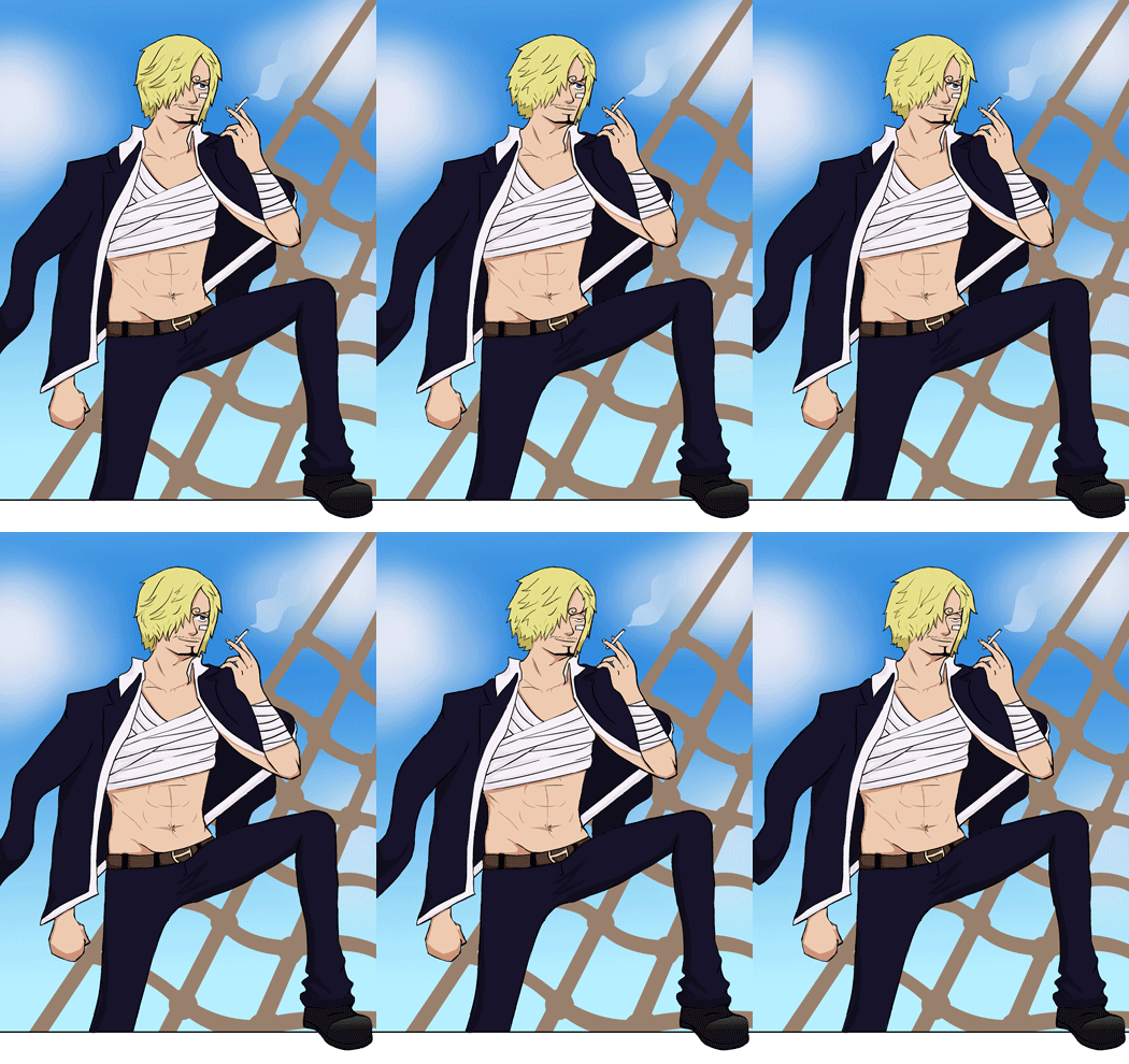
I enjoyed my first try at an illustration inspired by Rebecca Mock, so I decided to try another - this time applying the concepts much more to character animation than just a whole scene, as a chance to practice some animation without having to worry about creating a whole 40 seconds and having no idea how to do that well. I have used another piece of fan art so that I don't focus too much much on designing new things, and so that I can apply this technique to other peoples' designs if need be,

I have missed being able to focus so much on thicker lines, especially when doing smaller or more detailed images. It was fun being able to go fairly thick, although I would have to keep in mind the brush size when animating. I did these lines in Paint Tool SAI which gives me much clearer, crisp lines than in Photoshop, no matter what the settings.


I used the anime for colour reference, before upping the saturation slightly because I like working in much brighter tones.

I didn't want to use the same shading as last time or too many blurry elements on the character because that would make animating him a lot harder. I don't think it would have been as effective with my thicker lines anyway, so it looks better this way. I added a few cloud shapes before blurring them along with a translucent layer for the smoke.


This piece is animated fully in Photoshop rather than After Effects, since I don't think there would have been any way to get the effects that I wanted, except maybe the smoke. It was nice to try more hand drawn animation again, although I still don't think I could do a longer piece with more animation and really enjoy it. This was fun though and I would like to maybe try it on some of my own characters at some point and see how animating different parts of the illustrations changes the focus of the image.

This has a lot more animation in than Mock's pieces, but I think it works since the focus is on the character rather than the background. The foot outside/on top of the frame was unintentional; I left the edge of the ship white while I was working on the rest of it, but I like the almost 3D effect it gives, and it would be fun to play around with a bit more.

This has made me a little bit friendly towards 2D animation again, although I still don't enjoy it as much as designing but if it can be used more as a tool to explore and/or show off my designs and illustrations then I am willing to play with it again.

Tuesday, 16 December 2014

Animating Illustrations: Illustration 1 Animated

After completing my illustration, I separated the layers for animation - lights on the red jumper, the star/spring on the headband and the layer of smoke above the mugs, merging the rest together to make working in After Effects much easier. After creating an After Effects project, I imported the .psd file, keeping the layers separate. I used effects and the glow tool for the lights on the jumper, which was extremely easy and something I have experimented with before.

For the smoke I changed the scale, size and opacity between frames but it doesn't move that well, and next time it may be easier to animate in photoshop, maybe over 12 frames and the repeating them

I had fun animating the star the most. I rotated the image first, but it rotated from the wrong point so rather than using a lot of positioning keyframes as well, I created a null object and placed it at the base of the spring. I parented the layer to the null object, creating my rotation keyframes through that rather than the layer. This time the image rotated from the right point, but it looked too flat and not very believable. I wasn't sure how to go about this, but I guessed that using the same sort of technique could work. I duplicated the star/spring layer, before using the eraser tool to delete the bottom half of the spring. I then placed another null object where that spring half of the spring started, parenting it again. I tried rotating it on top of the rotated star below, and it let me give a much more exaggerated movement. I erased the bottom half of the spring on the original layer, so that between the two layers they made up one full image.

I had to use a lot more position keyframes though to match the top half of the star to the bottom half, since the point where they should connect obviously moved when the bottom of the spring was moved. This didn't take too long though, and eventually I got the animation working with both parts.

I had a lot of fun creating this image; I feel like I found a way to colour that I enjoy and could actually finally stick to, and just trying to backgrounds more makes me want to actually concentrate on creating a few more complicated and well thought out backgrounds. I learned more in After Effects about movement and null objects than I expected to, and even though I am not a huge fan of animating, I am actually excited to try some more small pieces of After Effects animation to go on images I create. This was definitely a great exercise, and I would recommend it to other animators/illustrators.

If I was to do that again, I would probably think about the overlapping action a lot more, maybe separating the spring into three parts instead, and making the top half have a more exaggerated movement so that it was still very much to the side while the base began to move the other way again. I could still have had a lot more parts of the image animated, as they are more subtle I think than Rebecca Mock's, so in the next piece I make, I will take into account the pieces that could move/change/interact and what would add something extra to the illustration if it wasn't still.