Tuesday, 27 January 2015

How To Make A Portfolio For Character Design

As Character Design is my main focus, especially at this point in time, it is important that my portfolio will reflect this. It needs to be able to show my skills and persuade people to hire me. Of course, there isn't always one exact way to do things - thinking outside the box always helps, especially in a creative situation, but I have found some tips and ideas to help me make a more effective portfolio.

The first thing I found was a few tips for portfolios intended for students applying to Sheridan's Animation program that was the choice of university for many Disney, Pixar and Dreamworks animators/directors. There will be some difference between a portfolio for university and industry, but I feel like these tips are a good place to start for looking at the sort of things to include.

4. Character Rotation -Draw a character rotation of your original character design using the following views. Put each view on a separate (8.5” x 11”) sheet. The sizes and proportions of each view should be consistent with the other views.
• front view
• 3/4 front view
• profile view
• 3/4 back view
• back view

5. Action Pose Sheets – two action poses of your original character (each pose on a separate 8.5” x 11” inch sheet). Keep these drawings rough and loose.

6. Expression Sheet – On one sheet only, draw your original character’s head with five different expressions (see below). Show dimension by changing the angle of the head for each expression. You may choose to draw these heads on larger paper and cut, paste and reduce if necessary to arrange all five heads on one 8.5” x 11” sheet, but you need to include the original drawings as well as the reductions.
• neutral (normal expression)
• angry
• happy
• sad
• surprised

Another place I have found tips is on Grizandnorm's Tumblr, under their 'Tuesday Tips'. The Tumblr is run by Griselda Sastrawinata and Normand Lemay - Griz is a character designer/visual development artist at Dreamworks and Norm is a storyboard artist at Disney.

Tuesday Tips — Portfolio 101.
With the end of the year/the beginning of the year fast approaching, it’s a good time to revamp your portfolio.  These are some quick tips for visual development/character design portfolio.
1.  Know what you want on your finish book.
Work backwards — decided on how many pages you want, then work from there.
2.  Best piece on the first page, second best on the last page, and third best in the middle.  (Something that I learned from Art Center.  This doesn’t always work out, but it’s a good thing to remember and I do my best to put my best piece on the first page).
3.  Rythm.  Make sure it flows nicely.  Most of the time, you’re NOT there in person when someone is looking at your book; so it’s a good idea if it tells a story and make sure it is telling who you are as an artist and what can you do to help out the team.
I also put an example of a thumbnail if I were to plan a 24 pages printed visual development  portfolio.
Have fun
Griz
 
Another Disney artist that I respect, Chris Oatley, says: "In more than a decade of reviewing character design portfolios at art school Q&A sessions, comic cons and online, I have met many skilled artists. …but I almost never meet an aspiring or pre-professional character designer who actually understands the job. Typically, these artists rush into the design without getting to know the character."
-

"If you want to design complex, surprising, believable characters and get someone to pay you to do it, you’re going to have to be consistently surprising."
-
"So until you’re a seasoned pro, slow down and don’t give up until it’s great."

If you’re happy with your design, re-design it. Why not? You might surprise yourself and create something even better! If you’re happy with what you have, you have nothing to lose by trying a different, more surprising version" -Oatley"


I can see that I really need to focus on making a character believable and complex; focusing only on design isn't enough. I'm excited to get more work done to be put in my portfolio with these ideas and a clearer direction of where to go and how I need my portfolio to look.

Monday, 26 January 2015

Business Cards

Business cards are great for networking - it's an easy way to give people your name, contact info and possibly even an example of the work you do, depending on how you design your card.

I like to keep a lot of my favorite business cards on my wall both for reference and just because they look good. Most of these are from Thought Bubble, which is a great chance to find business cards and, if I do get a table next year, give them out as well.


My most favorite ones though are the ones that I feel stand out much more. For some of these it is the coloring, like the pink and Brogan Coral's pink and purple card, and the one above it. I also like how Maris Wicks and Gemma Correll have turned theirs into something other than a card with some illustration and a name on them - they're fun, and they stick out, and I feel like they give you a better feeling of who the person is and what sort of art they are likely to produce. I like how the simple text of The Space Adventures card gets to the point but stands out - there is no clutter on the card and there isn't any tiny, superfluous text that is hard to read. I also like the contrast and use of white in the card next to it, for Will Kirkby; the illustration takes up most of the card with the text overlaid, and it is a lot more interesting to look at than a lot of the ones in the image above, with one illustration and then a small block of text. It is more noticeable and is more unique than the ones above, as there are a lot less that seem to be using this technique. 


Making a business card looks fun, but there are so many places you can start with. I have already decided on rounded edges if possible just because of how much better I think the cards look with them. I am not sure whether or not to do a self portrait type card like some of the above, or have examples of my work instead. I might have to experiment with this and see which look better. I also have the choice of more text or more illustrating - I don't think that an even mix of both is as effective as seen in the first image, but I think that since I like my work to be bright with thick lines, using more illustration could be a good way of getting my card to stand out.

Thursday, 15 January 2015

What Is Visual Development?

Visual development is a very important part of creating an animation, game and other types of visual entertainment. Also called concept art, it is a key starting point to get the look and the feel of the product. Someone who works in vis dev will work closely with other departments such as Production design, Art Direction and others to take ideas further to finished production ready pieces. Visual development helps a lot when it comes to world building, something that I really love the sound of. Backgrounds, props, characters, colours and lighting are all an important part of building up this world into something enjoyable, different but still relatable.

Depending on the industry in particular that you are talking about and who you ask, visual development can refer to different things. Using the term 'concept art' often makes people think of a fully rendered, beautifully painted piece of art that accurately shows the final idea of what the piece of media is going to look like. This is not what, by most professionals, is called concept art. A quote that I think explains it really well from here is that "the final audience is never going to see a piece of concept art. They are only going to see the result of the communication between the concept art and the development team". The point of concept art is to generate ideas and create the world and things inside it for the project. This is why I am picky with a lot of art books - some are almost exclusively this 'concept art' that shows nothing of ideas, just painted scenes of what I can already see in the game/animation etc. I like to see initial designs, how they evolved and what might nearly have been chosen to work with instead. I feel like understanding what has informed the ideas and what alternatives were thought about helps you to understand the fictional world even more, and to me that is much more exciting than a pretty painting.


The games Mass Effect, Bioshock Infinite and Borderlands are some of my favorites when it comes to visual development/concept art; it is very clear where they came from and where they are going throughout their designs, and it's great to see what could have been.

Tuesday, 6 January 2015

What I Want From This Year Update

I have decided that I would be better off putting my effort into just one area - design. I don't think that I would have time to explore both design and 3D modelling in enough detail at the same time, and looking at 3D as well would take time away from more design projects that could be done to fill up my portfolio which I think is going to be one of my main aims this year. I want to concentrate on getting a lot more character design done - but still with a bit of prop and environment design, which could also help to show my characters in context.

I think that this is a much better idea for actually achieving something by the end of the year, but that isn't to say I have given up on 3D modeling -  I am happy to do some when needed in a project and I might do the occasional bit to help show off my designs but I think it would be better to look at that after I am on my way to having a solid portfolio.

Animating Illustrations: Illustration 2 Animated

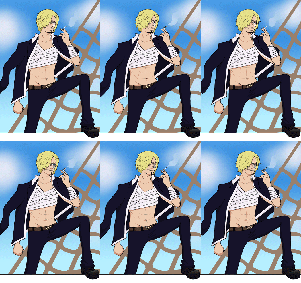
I enjoyed my first try at an illustration inspired by Rebecca Mock, so I decided to try another - this time applying the concepts much more to character animation than just a whole scene, as a chance to practice some animation without having to worry about creating a whole 40 seconds and having no idea how to do that well. I have used another piece of fan art so that I don't focus too much much on designing new things, and so that I can apply this technique to other peoples' designs if need be,

I have missed being able to focus so much on thicker lines, especially when doing smaller or more detailed images. It was fun being able to go fairly thick, although I would have to keep in mind the brush size when animating. I did these lines in Paint Tool SAI which gives me much clearer, crisp lines than in Photoshop, no matter what the settings.


I used the anime for colour reference, before upping the saturation slightly because I like working in much brighter tones.

I didn't want to use the same shading as last time or too many blurry elements on the character because that would make animating him a lot harder. I don't think it would have been as effective with my thicker lines anyway, so it looks better this way. I added a few cloud shapes before blurring them along with a translucent layer for the smoke.


This piece is animated fully in Photoshop rather than After Effects, since I don't think there would have been any way to get the effects that I wanted, except maybe the smoke. It was nice to try more hand drawn animation again, although I still don't think I could do a longer piece with more animation and really enjoy it. This was fun though and I would like to maybe try it on some of my own characters at some point and see how animating different parts of the illustrations changes the focus of the image.

This has a lot more animation in than Mock's pieces, but I think it works since the focus is on the character rather than the background. The foot outside/on top of the frame was unintentional; I left the edge of the ship white while I was working on the rest of it, but I like the almost 3D effect it gives, and it would be fun to play around with a bit more.

This has made me a little bit friendly towards 2D animation again, although I still don't enjoy it as much as designing but if it can be used more as a tool to explore and/or show off my designs and illustrations then I am willing to play with it again.